Repository navigation
AppBar doesn't apply overriden Theme #50606
Description
Activity
Issue exist
flutter doctor -v
[✓] Flutter (Channel dev, v1.18.0, on Mac OS X 10.15.4 19E266, locale en-GB) • Flutter version 1.18.0 at /Users/taha/Code/flutter_dev • Framework revision 8f7327f83a (31 hours ago), 2020-04-06 22:11:01 -0400 • Engine revision 49891e0653 • Dart version 2.8.0 (build 2.8.0-dev.20.0 1210d27678) [✓] Android toolchain - develop for Android devices (Android SDK version 29.0.3) • Android SDK at /Users/taha/Code/sdk • Platform android-29, build-tools 29.0.3 • ANDROID_HOME = /Users/taha/Code/sdk • Java binary at: /Applications/Android Studio.app/Contents/jre/jdk/Contents/Home/bin/java • Java version OpenJDK Runtime Environment (build 1.8.0_212-release-1586-b4-5784211) • All Android licenses accepted. [✓] Xcode - develop for iOS and macOS (Xcode 11.4) • Xcode at /Applications/Xcode.app/Contents/Developer • Xcode 11.4, Build version 11E146 • CocoaPods version 1.9.1 [✓] Chrome - develop for the web • Chrome at /Applications/Google Chrome.app/Contents/MacOS/Google Chrome [✓] Android Studio (version 3.6) • Android Studio at /Applications/Android Studio.app/Contents • Flutter plugin version 45.0.1 • Dart plugin version 192.7761 • Java version OpenJDK Runtime Environment (build 1.8.0_212-release-1586-b4-5784211) [✓] VS Code (version 1.43.2) • VS Code at /Applications/Visual Studio Code.app/Contents • Flutter extension version 3.9.1 [✓] Connected device (4 available) • SM M305F • 32003c30dc19668f • android-arm64 • Android 10 (API 29) • macOS • macOS • darwin-x64 • Mac OS X 10.15.4 19E266 • Chrome • chrome • web-javascript • Google Chrome 80.0.3987.149 • Web Server • web-server • web-javascript • Flutter Tools • No issues found!AppBar Theme Issue
I would like to add that the challanges with the AppBar theme go a bit further than just the issue with its brightness being tied to the brightness of the primaryColor of the overall theme. Here are my findings:
- AppBar Brightness has no function.
- Difficult to create a light AppBar theme when primaryColor is of Brightness.dark.
Applies to:
All Flutter platform versions and channels, going back at least 1.5 years.
Workaround
EDIT: While making this issue comment I towards the end figured out that nr 2 above is just a consequence of no geometry being available at the point when the app bar text theme is being made. More about this in the conclusion at the end.
I left all the written reasoning of how I got there intact, as I think it might help others struggling with the AppBarTheme understand what is going on.1. AppBar Brightness has no function
The AppBar theme's brightness property has no function or relevance, it has never done anything useful.
I agree with the finding in the related issue #61618 that if you do atheme: ThemeData( appBarTheme: const AppBarTheme( brightness: Brightness.light), ),
It is then a fair assumption that it would force dark text and and dark icon theme if you set
brightness: Brightness.light, if icon and text properties are not specified by the appbar theme itself, and vise versa for Brightness.dark. However, it does not do anything useful, other than carry the info if set correctly in relation to the color property of theAppBarTheme.2. Difficult to create a light AppBar theme when primaryColor is of Brightness.dark
The header is a bit short and needs elaboration. The coupling of the AppBar's text theme to the overall
primaryTextColortheme is so tight that it is actually very difficult to get around it. It's bond is so strongly that it is currently impossible to create an AppBarTheme that goes against this coupling without breaking some parts of it.For example it is impossible to create an AppBar theme that is light (usually then the popular white appbar) and need black typography, when the overall theme is light and its
primaryColoris of Brightness.dark, thus creating an overall theme where theprimaryTextThemegets white typography.Below some examples of what one might try when trying to make a light or often white app bar. I'm just using grey in the examples so both white and black text can be seen on the appbar.
2.1 Demo of AppBar's coupling to primaryColor and primaryTextTheme
Lets start with:
theme: ThemeData(
  appBarTheme: AppBarTheme(
    color: Colors.grey[300],
    brightness: Brightness.light,
    textTheme: const TextTheme(),
    iconTheme: const IconThemeData(color: Colors.black87),
    actionsIconTheme: const IconThemeData(color: Colors.black87),
    elevation: 0),
  ),
It will result in an appbar like this, which is surprising, well it is if you expected that the brightness setting should give you dark text:

Now let's try to make the text dark manually by changing the AppBar's TextTheme, first we try this:
theme: ThemeData(
  appBarTheme: AppBarTheme(
    color: Colors.grey[300],
    brightness: Brightness.light,
    textTheme: Typography.material2018().black,
    iconTheme: const IconThemeData(color: Colors.black87),
    actionsIconTheme: const IconThemeData(color: Colors.black87),
    elevation: 0),
  ),
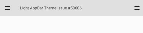
and second try this this variant:
theme: ThemeData(
  appBarTheme: AppBarTheme(
    color: Colors.grey[300],
    brightness: Brightness.light,
    textTheme: const TextTheme()
        .merge(Typography.material2014(platform: TargetPlatform.android).black),
    iconTheme: const IconThemeData(color: Colors.black87),
    actionsIconTheme: const IconThemeData(color: Colors.black87),
    elevation: 0),
  ),
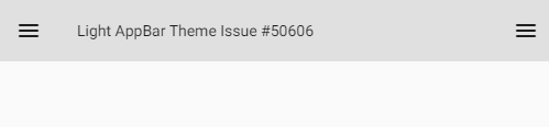
In both above cases we got black text, but the correct text styles are missing, all we get is a small default text style.
Let's try one more with the apply method.
theme: ThemeData(
  appBarTheme: AppBarTheme(
    color: Colors.grey[300],
    brightness: Brightness.light,
    textTheme: const TextTheme()
        .apply(bodyColor: Colors.black, displayColor: Colors.black87),
    iconTheme: const IconThemeData(color: Colors.black87),
    actionsIconTheme: const IconThemeData(color: Colors.black87),
    elevation: 0),
  ),
Well the style is OK, but the
applyblack color specification did not have any impact at all, which was surprising, we got white text but the style is OK.

The above examples can be found in this CodePen: https://codepen.io/rydmike/pen/RwrEodX
You just have to swap comment lines for the AppBarTheme's textTheme property to try them all.Seems tricky to do this, but let's dig deeper and try this. We create a ThemeData object first, apply its default text theme to the AppBar's text theme.
// Create a default light theme
final ThemeData themeBase = ThemeData();
// Store it's default text theme, it is already black for the light surface
final TextTheme blackTextTheme = themeBase.textTheme;
// Let's try to use this in a ThemeData Object and use it as a Theme
final ThemeData theme = ThemeData(
  appBarTheme: AppBarTheme(
    color: Colors.grey[300],
    brightness: Brightness.light,
    textTheme: blackTextTheme,
    iconTheme: const IconThemeData(color: Colors.black87),
    actionsIconTheme: const IconThemeData(color: Colors.black87),
    elevation: 0),
);
Result is this:

That was surprising and it seemed odd, so I also printed out a text with the copied
blackTextThemeand that gave me the clue that there is no geometry yet when we copy the theme. The geometry is applied in the localize process in the MaterialApp and apparently that is what is wrong with the text theme in all the other cases too.In this last case it obvious that it does not know about the geometry yet via Typography localisations, but it was a bit less obvious in the first CodePen when the ThemeData was constructed in the MaterialApp's theme property. It is easy to assume it will get correct geometry at this point, but the situation is of course the same, it does not yet have any geometry here either and when you make an AppBar theme yourself, it never gets any geometry applied during the localize process, it does not get applied to the custom AppBarTheme.
I noticed after some digging in the source code (always pays to do that, it is fabulously well documented) that it is the static method ThemeData.localize that actually applies the text style geometry and this is done to the
textTeme,primaryTextThemeandaccentTextThemethemes. Furthermore the call to do this typography geometry localization, is done by the Theme.of static method, which of course needs a build context for the inherited theme widget. So basically we cannot easily make a text style for any theme with geometry that that should also depend on localized Typography, before we have a context. Well that was interesting and raises some new questions.In any case, now that we figured this out, we can of course apply
englishLikegeometry to see if we can get it to look right. First we test to fix the above example:// Create a default light theme final ThemeData themeBase = ThemeData(); // Store it's default text theme, it is already black for the light surface final TextTheme blackTextTheme = themeBase.textTheme.merge(Typography.englishLike2018); final ThemeData theme = ThemeData( appBarTheme: AppBarTheme( color: Colors.grey[300], brightness: Brightness.light, textTheme: blackTextTheme, iconTheme: const IconThemeData(color: Colors.black87), actionsIconTheme: const IconThemeData(color: Colors.black87), elevation: 0), );
And finally we get an AppBar with the correct style and color.

The CodePen for the above example can be found here: https://codepen.io/rydmike/pen/PoZVNxr
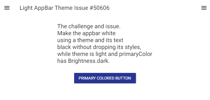
Now we can also apply this workaround solution for the original challenge to make a white AppBar, for a light theme, with a dark primary color, like so:
MaterialApp(
      debugShowCheckedModeBanner: false,
      title: 'Flutter Demo',
      theme: ThemeData(
        primaryColor: Colors.indigo[800],
        scaffoldBackgroundColor: Colors.white,
        appBarTheme: AppBarTheme(
          color: Colors.white,
          brightness: Brightness.light,
          textTheme:
              Typography.material2018().black.merge(Typography.englishLike2018),
          iconTheme: const IconThemeData(color: Colors.black87),
          actionsIconTheme: const IconThemeData(color: Colors.black87),
          elevation: 0,
        ),
      ),
      home: MyHomePage(title: 'Light AppBar Theme Issue #50606'),
    );
The result:
Conclusion: Remaining issue and why I gave it a "Workaround" status
Apart from being very complex to figure out how to get the desired end result, creating an AppBar theme this way results in one that will not get typography localization's applied to it as a apart of the localization process, so now you have to deal with that part yourself in the app. This is thus not really a working solution for an international app. How can we get around this? I have to experiment with that a bit, have some ideas, but I need to experiment more with it.
--
A white app bar, in a light theme is a very popular design, focus remains more on the content. The design trend started on iOS, but has spread to Android and Material too. When done right it looks very nice. Currently it is very complicated to make such a design that is purely theme based in Flutter.
You can of course forget about a theme for your white app bar and just make a custom app bar widget that checks if its color is light and then sets its icon theme and text color to black or black87, then you can keep your Typography localization functionality. But imo, theming an app should really be made using themes and not via widgets in the app, to be easier to maintain and change from a central point.
Clearly a better way to make light or white AppBarTheme is needed.
It would be simple if the AppBar brightness property just forced appropriate black or white typography for the text and icons in the AppBar, unless you have explicitly specified something else. Other users seem to assume it should do just that as well: (#61618), so did I when I first tried it.
Reacted by Serge Matveenko, Konstantin Dovnar and Yuri KoshiishiReacted by Gabriel Rohden, Nicholas Ray and Konstantin DovnarReacted by Jeremy Offori, Dominik Roszkowski, Hillel Coren, redsolver, Jamie Halmick, TheManuz, Scott Cook, Gabriel Rohden and Serge MatveenkoWould you consider submitting a pull request to fix this, @rydmike? I suspect you've followed this rabbit hole far enough to have a good idea of the fix... Also /cc @HansMuller for interest.
IIRC @HansMuller was changing several themes, starting for the new Buttons theme that's about to be released... I memory doesn't fails the AppBar's theme system was in the same roadmap, so this issue might be a part of a bigger future change in the framework entirely.
@feinstein I agree it is indeed quite an involved topic and I am aware of the redesign/improvements going on with the entire Theme design. I think I read a design doc on it a while ago, but can't find it of the top of my head. I have also noticed that @HansMuller has been doing a lot of work on themes lately. I hope he has a chance to look at the challenges with the AppBar theme too. It might actually be a bit tricky solve due to legacy reasons without breaking things, well maybe easier if you add some new features, probably the new targeted way of handling all sub-themes can handle the needed scenario if done so in the app bar theme.
@timsneath My exploration was more of a discovery and learning what is is going on with this challenge.
I dug into after noticing how difficult it was to create a white app bar theme for an overall "light" theme where the primary color is dark, which it mostly is for a light theme. I asked around in a few communities and everybody that tried it ended up either with a white app bar text theme (invisible on the white app bar) or an app bar text theme that was black, but without geometry (small default font). This when the constraint was that you have to do it with just the Theme factory, create a ThemeData class (and its context free helpers) without any context that you can then later apply to your app or anywhere.Considering how popular the white app bar look is on iOS and that it gets copied a lot also on Android now, I think it does need to be easier to do this correctly with a theme.
Also I still have no idea how I should do it (given the above constraints) in away that would allow me to keep any typography localisations applied to the app bar text theme later. The above workaround example ignores that for now and actually breaks the localization since it no longer uses any of the 3 standard built in text theme's in ThemeData (textTheme, primaryTextTheme, accentTextTheme), but it works for my use case since I don't yet need those localisations, the English like is fine.
Generally I think it can sometimes be a bit problematic that we cannot get a ThemeData object with geometry before we have a context that can be used to localize it. But I understand why it is like this. I guess as long as we can create ThemeData object, including all of its sub theme by just using textTheme() when sub themes need a text theme and it then also gets correct black/white text theme for the surrounding theme conditions, that then get localized correctly, it can go pretty far as is. I think this actually worked for some sub themes I tried it on, but for some you get a null error if you try it.
On a concept level many of the issues with the default color of the text theme is imo rooted in it all being based on textTheme, primaryTextTheme and accentTextTheme in ThemeData, instead of just having one dark and light text, that would get used when the surface that the text is on, needs dark or light text for optimal contrast, but like I hinted that is a much bigger topic and this issue can certainly be fixed somehow within the current constraints.
@HansMuller A bit of topic, but on the topic of theme issues and their development. Regarding the new way of theming, starting from a ColorScheme and using ThemeData.from(colorScheme). Is there a plan to include onColors for primaryVariant and secondaryVariant in a future revised version of ColorScheme?
If you make a theme where the variant color actually needs another onColor than its corresponding primary (the example dark theme in the Material design guide is actually an example of this), there is no way of getting that info from the ColorScheme. You now have to check brightness separately when you want to use the variant colors, e.g.
ThemeData.estimateBrightnessForColor(Theme.of(context).colorScheme.primaryVariant)just to know what text/icon brightness you should put on it, seems a bit tedious.If this is something that to your knowledge is not yet on the road-map, let me know and I can post an enhancement issue for it.
I have also noticed that if you currently create a theme using
ThemeData.from(colorScheme)that the theme for some sub-themes are not in-line with the supplied colorScheme, some widgets still get their defaults from the Theme factory defaults, which will not match the supplied colorScheme. I'll make a separate issue of which ones I have noticed that still have minor issues, perhaps they are also already being addressed. It was maybe only 2 or 3 cases that I have noticed recently. I will follow-up on this in another issue later.@feinstein - if you have time to look, I hope you'll provide a little feedback about #71184 which updates AppBar with the overall goal of making color and text style customizations easier.
In terms of your example, the text/icons foreground color can be specified explicitly with the changes from #71184:
AppBar(
  backwardsCompatibility: false, // temporary
  foregroundColor: Colors.white,
  ...
)
The overall theme's AppBarTheme can be used to configure the foreground and background colors for all AppBars via its foregroundColor and backgroundColor properties.
@HansMuller I had a very long day but couldn't miss this update. I really enjoyed it! Specially the
systemOverlayStyle, thank you, I was really missing this, as we discussed before.@HansMuller just reading
colorScheme.onPrimary if the theme's brightness is lightforforegroundColorbrings a lot of joy.This is a really nice and welcome improvement. I added a comment here #71184 (comment)
Basically just saying it look really good and that when this lands in master I will test it by trying the things I tried above in comment #50606 (comment). Just to see and demonstrate how it works in practice with the new features. When I have tried it I will add my findings as a comment to this thread.
Thanks again @HansMuller, I just tried it, and it works beautifully, just like you mentioned here too #71184 (comment) and of course also when using just the old default ThemeData() factory as well, instead of the simpler and newer
ThemeData.fromColorSchemebased factories that you showed.Here just as a confirmation demo of this as well, since I mentioned above that I was going to show it for reference as an additional comment heer.
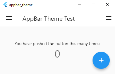
An app with ThemeData like this using the new AppBarTheme() features, just applied to the default counter app:
void main() {
  runApp(MyApp());
}

class MyApp extends StatelessWidget {
  @override
  Widget build(BuildContext context) {
    return MaterialApp(
      title: 'AppBar Theme Test',
      theme: ThemeData(
        brightness: Brightness.light,
        primarySwatch: Colors.blue,
        appBarTheme: AppBarTheme(
          backgroundColor: Colors.white,
          foregroundColor: Colors.black87,
          elevation: 0,
        ),
      ),
      home: MyHomePage(title: 'AppBar Theme Test'),
      debugShowCheckedModeBanner: false,
    );
  }
}
Easily now gives us a white app bar with dark text, even though the primary color is of brightness dark and in older version would have forced the text theme to white for the app bar. Nice! It also works if you switch the brighntess to Brightness..dark, the app bar keeps it colors as sepcified.
Practical usability issue during the migration period
I think the only thing I would have wished for to make the migration easier and to get it to apply to all
AppBars in an app, would be a way to toggle the desired default behavior via a flag in the overallThemeDataor in theAppBarTheme, kind of like you can with theuseTextSelectionTheme.To have the temporary setting for the
backwardsCompatibilityflag either in the overallThemeDataor even just in theAppBarTheme, that then gives the default for theAppBar's own setting for it, that might as now have its own setting just in case there is a need to override the theme based setting on anAppBarlevel, perhaps for some migration use cases.As it is now, you have to go and set the
backwardsCompatibilityto false for everyAppBarin your app where you want to use the newAppBartheming features. This actually makes opting in to use it difficult, or to migrate to it, since you have to go and set thebackwardsCompatibilitytofalsefor everyAppBarthat you create/have in your app, and there might be quite a large number of them. Later when the flag is deprecated you have to remove it again from all instances.If it would be possible to set the flag also via a parameter in the
AppBarTheme()in the example above, it would not be necessary to opt in again when you actually create theAppBars in your app, like below for this example. You can then omit it there since you already opted in via theAppBarTheme, which you probably just define in one place, or much fewer places than theAppBars at least.Maybe I missed something, but I tried looking in
AppBarThemeandThemeData, but I did not see any opt in option before the actualAppBarcreation, it is as described above a bit impractical to only have the opt in option there. If that really is the case that is, maybe I missed something?class MyHomePage extends StatefulWidget { MyHomePage({Key key, this.title}) : super(key: key); final String title; @override _MyHomePageState createState() => _MyHomePageState(); } class _MyHomePageState extends State<MyHomePage> { int _counter = 0; void _incrementCounter() { setState(() { _counter++; }); } @override Widget build(BuildContext context) { return Scaffold( appBar: AppBar( title: Text(widget.title), backwardsCompatibility: false, ), body: Center( child: Column( mainAxisAlignment: MainAxisAlignment.center, children: <Widget>[ Text( 'You have pushed the button this many times:', ), Text( '$_counter', style: Theme.of(context).textTheme.headline4, ), ], ), ), drawer: Drawer(), endDrawer: Drawer(), floatingActionButton: FloatingActionButton( onPressed: _incrementCounter, tooltip: 'Increment', child: Icon(Icons.add), ), ); } }
This thread has been automatically locked since there has not been any recent activity after it was closed. If you are still experiencing a similar issue, please open a new bug, including the output of
flutter doctor -vand a minimal reproduction of the issue.- locked as resolved and limited conversation to collaborators
on Aug 7, 2021


I have a very simple
AppBaroutside of aScaffold, like:Which renders like:
The
MaterialAppthemeprimaryColorBrightnessisBrightness.light.Now, if I change the
MaterialAppthemeprimaryColorBrightnesstoBrightness.darkthe status bar color AND theAppBaricons and text change to white:But if I just want to change the
ThemeforMyScreenand not the whole app, the status bar changes color to white, but theAppBardoesn't:As can be seen here:
This inconsistency seems like a bug to me.