Repository navigation
CupertinoTextField default font differs from that of UITextField's default. #67953
Description
Activity
CC @MitchellGoodwin maybe something to look at in the comparison tool, not sure what's different.
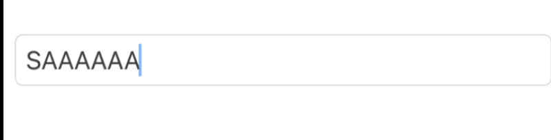
Compared to the text in both CupertinoSearchField and CupertinoTextField, the font weight of a SwiftUI text input does seem to be different slightly (or I've gone crazy from staring at pixels too much). Here's an S side by side for comparison.

The Flutter text is on the left, the SwiftUi is on the right. The tricky thing is that the text's font weight seems to be in between ourFontWeight.w400and ourFontWeight.w500. Maybe by about 20%, as far as my eyeballs can tell. In order to match native, seems like we'd have to either:- Adjust the font weight enums to match perfectly.
- Do something tricky to the default font to get it to match, which the developer would likely not be able to match fully with a
styleoverwrite.
Both of these feel like overkill and a small breaking change that may break too many goldens compared to the benefit they'd bring.
However the padding of both CupertinoSearchField and CupertinoTextField can be adjusted to match native a little better, which causes the text to overlap a little more naturally.
CupertinoSearchField defaults before:

And after adjusting:

It's a little harder to see with the CupertinoTextField, but here's the SwiftUi text field overlayed the Flutter CupertinoTextField at 50% opacity. Before:

After
I think for now just making the adjustments to the padding would be fine? And we can see if there's interest in making the small adjustment to the font size?
Thanks for doing that detailed analysis! The padding change seems like a major win to me...
Partially addressed by #113958 adjusting the padding. If there's enough interest in getting the font width for the weights 100% aligned, we can reopen this issue, but I'm going to close this as that would be a fairly substantial change for a lot of apps for seemingly not a lot of interest.
Reopened from merge failure
Addressed by #115164
This thread has been automatically locked since there has not been any recent activity after it was closed. If you are still experiencing a similar issue, please open a new bug, including the output of
flutter doctor -vand a minimal reproduction of the issue.- locked as resolved and limited conversation to collaborators
on Mar 5, 2023


The UIKit textfield's font seems to be a bit narrower. Two examples: