Repository navigation
Active subrange within composing range should be visually highlighted in Flutter #68547
Description
Activity
- changed the title
[-]Active subrange within composing range is not visually represented in Flutter[/-][+]Active subrange within composing range should be visually highlighted in Flutter[/+]on Oct 20, 2020 /cc @HansMuller @justinmc
I believe this is a requirement for Desktop launch in CJK locales.
Is this something we're also missing on mobile?
Is this something we're also missing on mobile?
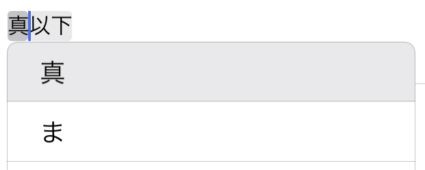
Yes. This is required on devices using a physical keyboard. I've added a screenshot of the UI for iPadOS 14. I haven't tested on an iPhone using a bluetooth keyboard but that is a supported configuration.
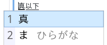
I should have added a Windows screenshot today, but I can verify it looks effectively like Chrome.
Reacted by Justin McCandlessExample video on macOS of the way users can move the active region around the comping region, and how that affects candidate menu position to give a better idea:
macOS_ime.mp4
This issue also affects Android, even without a hardware keyboard.
With the Gboard Japanese keyboard, the expected behavior is just like in the original description above, except that instead of shift-left arrow, you use the software keyboard's left and right arrows. When a composing region is active, these arrows move the end of the active region, and are restricted to within the composing region.
In a native Android app, the highlighting is:
- The whole composing region is underlined.
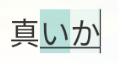
- The active subregion is highlighted in an aqua-green hue. (Distinct from the selection color, which is more blue.)
- The rest of the composing region, if there is any, is highlighted with a lighter version of the same color.
Here's a screenshot after step 4(a) of the repro steps above: the middle of three characters is the active region, and the last two characters together are the composing region. This is on a Pixel device running Android 13. A screenshot of a selection is at the right for comparison.
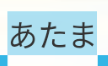
(Oddly the caret is still painted at the end of the whole composing region. I checked multiple native apps and they all have this behavior. I don't know whether that's a design choice or a bug. Edit: Probably a bug, because it turns out that in a slightly different situation the caret gets painted in a place that surely can't be intended: #122490 (comment))
The current actual behavior in Flutter main, on Android, is that the whole composing region is underlined and there is no highlighting or anything else to indicate the active subregion:
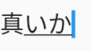
Current behavior in more detail
In more detail, the current actual behavior is:
-
If you ignore the visual feedback in the text field itself, and just focus on the keyboard, it actually works perfectly.
But the feedback in the text field is confusing enough that many users may never discover that.
-
The whole composing region is underlined, and the caret is painted at the end of the composing region, regardless of where the active subregion is.
-
Unless, that is, you shrink the active subregion all the way to be collapsed at the start of the composing region. In that case the caret is painted there at the start.
Curiously the odd Android-native behavior mentioned above, where the caret is always painted at the end despite the active subregion, has this same exception: if you move all the way to the start of the composing region, then the caret is painted there instead of at the end.
-
-
There is no indication of the active subregion at all. (Unless you collapse it all the way to the start.) So when you press the left arrow to try to shrink the active range, it looks in the text field like it didn't do anything.
- (On the other hand if you look at the keyboard's suggestions, they will have updated exactly as they should. Also if you hit delete, or type more kana, the deletion or insertion happens correctly at the end of the active subregion, even though that's not where the caret appears to be.)
13 remaining items
- added a commit that references this issue
on Jan 16, 2024 The
triaged-desktoplabel is irrelevant if there is noteam-desktoplabel orfyi-desktoplabel.This issue is marked P1 but has had no recent status updates.
The P1 label indicates high-priority issues that are at the top of the work list. This is the highest priority level a bug can have if it isn't affecting a top-tier customer or breaking the build. Bugs marked P1 are generally actively being worked on unless the assignee is dealing with a P0 bug (or another P1 bug). Issues at this level should be resolved in a matter of months and should have monthly updates on GitHub.
Please consider where this bug really falls in our current priorities, and label it or assign it accordingly. This allows people to have a clearer picture of what work is actually planned. Thanks!


Description
When inputting text in languages that use multi-step input (composing mode), there are two ranges involved:
This is common when inputting text using ateji in Japanese, but occurs in general with longer composing ranges, person, and place names.
To support this, we'll need some visual highlighting of the text to make clear which range is the active subrange, as well as changes to the text input protocol so that the engine can specify this range to the framework. It seems unlikely to me that users will need to programmatically control the range via TextEditingController, so ideally the API surface should be as minimal as possible.
Repro steps and expected behaviour
For example, when inputting the name 真惟佳 (Maika), one would go through the following steps:
Visual representation
The composing region and active subrange are each visually highlighted to the user in some platform-specific way.
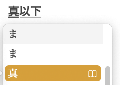
On macOS 11.0, Chrome, and Android, it is highlighted using a thicker underline with a small gap between it and the thinner composing region underline. In Linux GTK apps (and I believe older versions of macOS), the subrange is highlighted with a lighter colour than the standard selection colour.
macOS 11.0:
iPadOS 14.0:
Chrome on Linux:
Linux GTK apps: