Repository navigation
uBlock Origin on Firefox Preview #1027
Description
Activity
- locked and limited conversation to collaborators
on May 14, 2020 Bram Pitoyo
2019-11-12
Hi Raymond,
So glad to hear from you, and to have a chance to work together.
Maybe some buttons are not really needed on mobile?
Agreed. Generally, the more buttons we can take out, the less touch targets we’ll have per page. I’d be happy to assist you in doing an audit of features that are okay to excise for mobile, but I must first confess that I’m not a domain expert!
I wonder whether the text will neatly fits for all languages such that the layout stays the same in all languages.
Our text list items can scale up to 2–3–4 lines. Hopefully this can help rectify the language-fitting issue.
For icon + label items, the space is more limited, so they’re not as ‘stretchable’. I’d advise limiting the amount of items in this category. But a good alternative is to shorten some strings.
For example, instead of saying “Open the logger”, we may be able to say “Logger”. Instead of saying “Enter element zapper mode”, we may be able to say “Element zapper”. I’m not sure if this will impact clarity, though!
How does the overview panel fits in there?
I spent most of today taking a deep dive into features and sub-pages within uBlock Origin. I was able to adapt them and address some of your thoughts around information density.
The good news is, I found that these adaptations can, for the most part, be mostly visual. This means that no new feature or change in functionality is required. In some cases, that’s not possible. Have a browse below.
Main user interface
For starters, I thought that the entry point for the Overview panel should be clearly labelled.

It’s up to you whether this panel is expanded downwards and upwards, or whether it opens as a sub-page. In the example above, it opens in a sub-page.
Overview panel
When users tap “Overview panel”, a familiar-looking table appears.

The Overview panel has a high information density, so adapting it was challenging. My main concern was to have sufficiently large tap targets (48dp) while not losing any feature or complexity.
In the example above, Global and Local Rules are modes that you switch back and forth from/to. Allow/block controls are presented as status to the right of each domain name, and can be modified via a dropdown menu (if “Advanced mode”) is switched on.
Domain details
One thing that was missing from the Overview panel is +++ ---. I want not only to preserve them, but give them ample space so you can explain as much as you’re able to.
To view this domain information, the user can tap the domain name. It will open another sub-page. It has enough space to contain almost anything you want.

Dashboard
The dashboard contains a lot of tabs. We have a scrollable tab bar design that can fit all of them.

These examples may not sufficiently capture the full complexity of uBlock Origin, but hopefully they can still give you a taste of the flexibility that our Android layouts can offer.
Let me know what you think of these? If it’s helpful, I’d be happy to revise these designs and/or continue adapting more pages.
Raymond Hill
2019-11-21
Hello Bram,
Sorry for the delayed response. Regarding:
The Overview panel has a high information density, so adapting it was challenging. My main concern was to have sufficiently large tap targets (48dp) while not losing any feature or complexity.
I consider the high information density to be a key usability quality for advanced users (which is the purpose of that panel), as it allows to see a lot at a glance:
-
See what got blocked/allowed on which domains, along with a sense of quantity of the number of blocked/allowed requests (the --/++).
-
See all the rules currently in effect, and whether a local rule in inherited from a global one (i.e. pale shade versus dark one)
As an advanced user myself, I consider the "at a glance" aspect to be a key feature and would be unhappy to lose this when I have to assess/modify ruleset for the current site, so I consider this is something that must be as close to what it currently is.
Reacted by Mæve Rey, Matth78, Joseph C. Sible, ethernet, Jan Erik Petersen, 190n, Lucien Davison and Christos Papadopoulos-
Raymond Hill
2019-11-30
Hi Bram, feedback regarding the abstract.
I don't think the overview panel should expand before the extra tools, which are part of the basic panel. It should appear below the basic panel -- it's not always to be used for interactivity purpose but also just in read-only mode. The extra tools may affect the length of the overview panel list, the list may change as more requests are made by the page, so it's better that it does not keep pushing further down the extra tools. This is how it currently works in the mobile version of uBO.
The horizontal space available for the hostnames is too small. The abstract sceenshot show a case where all hostnames fit but in the real world this is going to be an issue. We need more horizontal space for the hostnames. Separating the cells with a single pixel space will also help recover space -- this is why this is so in the current version of uBO.
Also a detail, the minus sign should be
\u2212so that it's the same width as the plus sign.The toggle for JavaScript in the basic panel really need to be visible by default, we may need to remove "Block all pop-ups" toggle.
Bram Pitoyo
2019-12-01
Hi Raymond, thanks for your feedback. I’m addressing them below.
…the overview panel […] should appear below the basic panel […] This is how it currently works in the mobile version of uBO.
When I used uBlock Origin on Firefox for Android (Fennec), the overview panel opens to the side. But your suggestion of opening below the basic panel makes a lot of sense. See below:
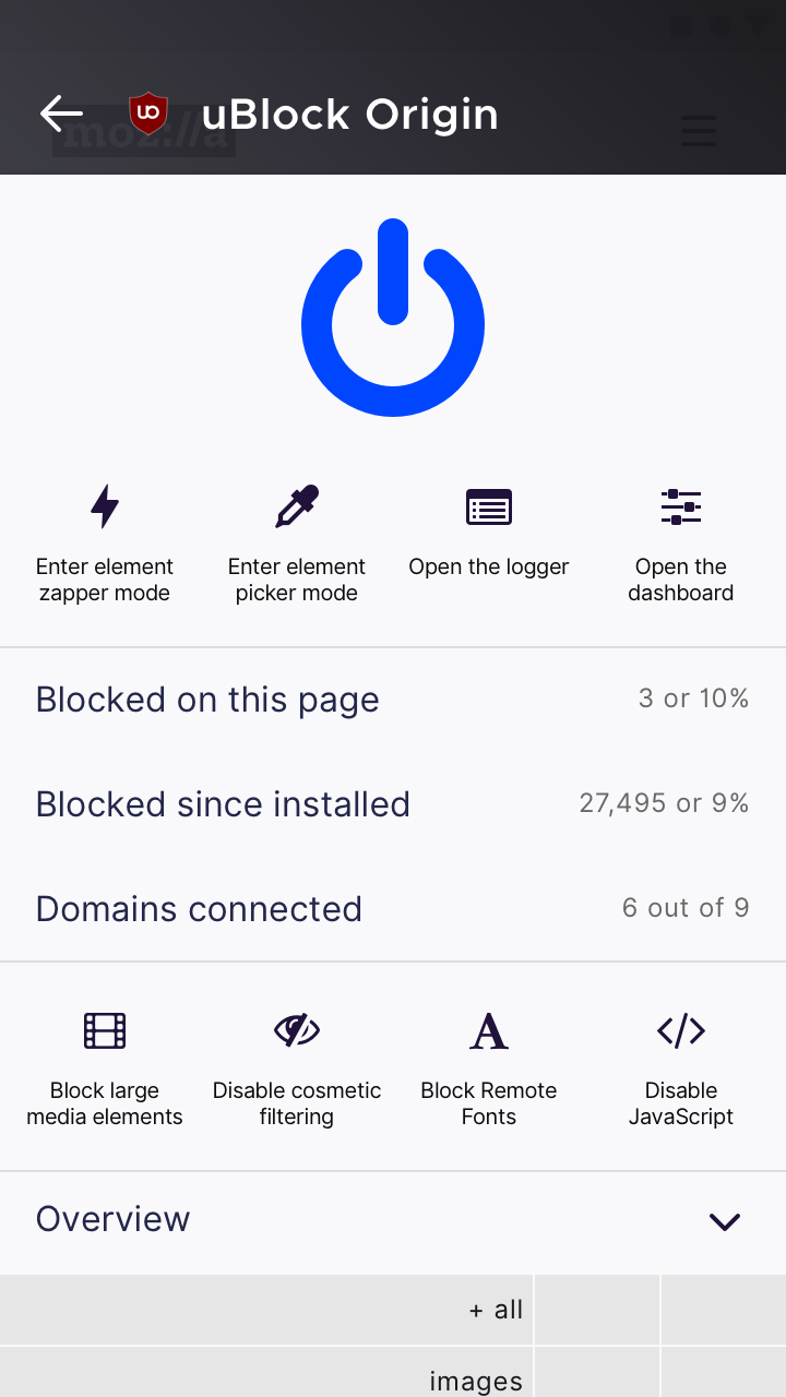
You’ll also notice that I’ve removed the “Block all pop-ups” toggle and show “Disable JavaScript” by default. I’ve also switched icons from our house style to FontAwesome – the same ones you’ve used on uBO – to present a more accurate picture.
My question: does it still make sense to call this area “Overview” and hide its content by default? (When hidden, the downwards arrow icon faces up).
The horizontal space available for the hostnames is too small. […] We need more horizontal space for the hostnames. Separating the cells with a single pixel space will also help recover space -- this is why this is so in the current version of uBO.
I took your suggestion and applied it. I’ve also switched to the correct minus sign (
\u2212). See below:
You’ll note that the hostname font size is now smaller – 14px → 12px – which may be as small as the font size on desktop. Hopefully this will make long URLs fit better.
One thing I didn’t change was the height of each row – it’s still 24px – and this is to keep the target large enough to tap. This, assuming that some mobile uBO users want to modify the Overview panels? If modification is less likely, we can narrow the row height down to 20px, 16px and so on.
Should you like to inspect the pixel-level design, the link stays the same:
https://share.goabstract.com/54f1465e-8d1c-4e7b-9ae4-f37e21bef7feWhat do you think? Thanks a lot for your feedback!
Raymond Hill
2019-12-05
Regarding:
When I used uBlock Origin on Firefox for Android (Fennec), the overview panel opens to the side.
Yes, uBO will by default opens the overview panel on the side. However it will calculate whether the panel fits well enough in the current viewport and if not it will send the panel at the bottom. This is why you can still get the panel on the side in landscape mode on a mobile display, or at the bottom on Firefox desktop when we pin uBO in the overflow menu.
So anyways, I think at this point we should start implementing the changes so that we can see and feel the real thing? How is this going to work? Do I make the changes on my side or are you going to make them on your side? The way I see it is to create alternate popup.html/css files and to enable them using browserAction.setPopup().
Bram Pitoyo
2019-12-08
I think at this point we should start implementing the changes so that we can see and feel the real thing? How is this going to work? Do I make the changes on my side or are you going to make them on your side?
Hi Raymond, I agree. I think that you should make changes on your side.
As far as implementation goes, it’s up to you whether there should be an alternate set of popup.html/css files, or whether there’s only one responsive stylesheet.
When you post some screenshots of your process, I’d be able to comment and send along my feedback.
In the near-term, this responsive design would fit well for purpose.
In the future, we hope to have some sort of a Firefox Mobile web component library for all add-on developers to use. You can already use Google’s Material Web Components for this purpose today, but it may not cover unique challenges that add-ons pose.
Talk soon,
BramBram Pitoyo
2019-12-15
Hi Raymond (and cc Philipp Kewisch),
If you’ve got screenshots or stylesheets, I‘d be happy to have a look and/or assist this week – just let me know how I can help!
For date and other technical questions, Philipp or Emily will assist.
At the end of my work week this week, I am planning to take some time off for Christmas and New Years, to return in late January.
–Bram
Raymond Hill
2019-12-16
Sorry I haven't had much time to work on uBO recently so I haven't started to work on this yet.
Raymond Hill
2020-01-25
Hi Bram,
I've committed a first draft of the redesigned popup panel, it's in the
dev build 1.24.3b11 of uBO, available at:https://github.com/gorhill/uBlock/releases
The new popup panel must be activated though as follow:
- Go to uBO's "Settings" pane in uBO's dashboard
- Check "I am an advanced user" option
- This is necessary to gain access to "advanced settings"
- Click the gear icon which appear after "I am an advanced user" once the option is checked
- A page opens with various text editor-based settings
- There should be an entry named "uiFlavor", which is set to "unset" by default
- Change the value to "fenix" and click "Apply changes"
- Now the next time you restart uBO, the redesigned popup panel will be used by uBO
So regarding the redesigned popup panel, I faithfully followed your design as per previous email. However I also made these fine tuning:
- I added a separator line below the power button
- I renamed "Overview" to "More", as in reality the revealed panel is really to gain access to more detailed information and/or advanced controls.
- The refresh, padlock and eraser buttons were not part of your redesigned, so for now I have relocated them at the top along the power button
- I made the power button sticky such that scrolling down what could be a long list of hostnames in the "More" panel will keep the power button and adjacent refresh/padlock/eraser buttons in view
So I guess we can consider this a first draft, I am open to change whatever you think is worth changing further, while for the "at a glance" firewall panel I prefer to keep it as is as I think it's difficult to improve upon (though font size, dimensions can probably be fine-tuned) as all the space available is used.
For the icons, they are currently all from forkawesome set of icons[1], but if you think better icons can be used then I am also open to improve this part -- since it's a redesigned, might as well maybe revisit everything worth to revisit.
Bram Pitoyo
2020-01-25
Hi Raymond,
Thanks heaps – very much – for your very prompt reply about the badge text and now the redesigned popup panel. We can’t wait to test it, and really hope that it will look great in Firefox Preview!
We will all be in Berlin for a Mozilla all hands even next week. Our replies might come late, unfortunately, but we’ll reply with feedback as soon as we can.
Until then,
BramBram Pitoyo
2020-02-05
Hi Raymond,
I was going to test the uiFlavour change that you’ve made, but unfortunately dev build 1.24.3b11 is no longer available to download.
When I downloaded the latest dev build 1.24.5b1, I wasn’t able to find uiFlavour under advanced settings. And when I tried adding uiFlavour manually, it didn’t work.
Do I need to download another special build to see the UI changes you’ve made? (If it’s too much work for you to make a special build, then it’s not a big deal – I’m happy to see a few screenshots from you).
Thanks again for following the design I sent out. I hope you felt like it was a collaborative process, and that uBO now looks better on mobile.
For the moment, I wonder whether you’ve looked at our icon library?
https://design.firefox.com/icons/viewer/#At the moment, our Android selection is limited, but we have heaps more in this folder, which is ready for you to use.
https://drive.google.com/drive/folders/1_DeNm4b9z94YhSnxQwhLu6f4mgghf9DN?usp=sharing
There are a couple of icons we have, which looks similar to ones you use. I’ll attach them on this email to save you time and effort:
- Energy.svg – similar to element zapper
- List.svg – similar to logger
- Preference.svg – not similar to dashboard, but we also use it for settings/preferences
- Pop-ups.svg – similar to block pop-ups
- Readermode Size.svg – similar to block remote fonts
Unfortunately, we don’t yet have the full suite of icon for you to do a total replacement. And I know you want interface elements to look like they belong together. Have you considered Font Awesome 5?
When I see the new interface, I’ll come back with feedback ASAP.
Thanks again,
BramRaymond Hill
2020-02-06
When you force an update of uBO, you need to restart it or restart Firefox, as uBO will not restart immediately upon update to avoid loss of user data. Be sure the version in the popup panel is the latest dev build one. Sometimes I found that I need to disable uBO, force an update, quit Firefox, launch Firefox then re-enable uBO.
Bram Pitoyo
2020-02-18
Hi Raymond,
On the last dev build, I wasn’t able to follow your instruction as the “uiFlavour” pref wasn’t there to modify. I was finally able to download the latest build and test the changes today.
I was really impressed by all the changes you’ve made. Thank you very much for rebuilding your UI and restyling it to fit! It has paid off. And when Firefox Preview releases to the public, uBlock Origin will be the first ever add-on to have a mobile-optimised interface.
At this point, I would consider your work complete. The only other set changes I would make, if you are open to it, are minor. They’re to bring your colour scheme in line with Fenix’s (so you look native), and to bring some UI elements in line with how Android works.
This work is totally optional. If you think that uBO’s desktop branding is important to carry to mobile, you can keep your existing stylesheet. The biggest chunk of work was already accomplished. The mobile UI you’ve built is enough to make uBO feel at home on smartphones.
Here are the optional changes I would propose for your consideration:
- Change body text colour to match Fenix Text colour
body {
color: black; → #20123a; (want something darker? Try #1d1133)
}- Change switch colour to match Fenix Blue colour palette
#switch .fa-icon {
fill: #0060df; (we also have these shades of blue: #054096, #0250BB, #0090ED, #00B3F4)
}- Change tool text and fill colours to match Fenix On-Light colour (identical to text)
.tool {
color: #444; → #20123a; (darker shade: #1d1133)
fill: #444; → #20123a; (darker shade: #1d1133)
}- Move icon badges from bottom-right to top-right (matches how badges work in Android)
.fa-icon-badge {
bottom: -20%; → top: -20%
}- Change hr border colour to match Fenix Separator colour
hr {
border-top: #ddd; → rgba(21,20,26,0.12); (flattened colour: #e3e2e3)
}- Change table background colour to match Fenix Grey (Light UI) colour palette
#firewallContainer > div > span {
background-color: #e6e6e6; → #e0e0e6 (alternatives: #cfcfd8, #f0f0f4, #f9f9fb)
}Screenshot of my result:

We also have a dark theme, which you may be able to target with @media (prefers-color-scheme: dark):

Perhaps Philipp can help us confirm whether add-ons can detect Fenix’s theme and show a different set of styles to suit?
Either way, we are good for release as it is.
Thanks so much, again!
BramRaymond Hill
2020-02-20
Hi Bram,
I did all the changes you suggested below -- they are parts of the uBO version 1.25.0 which I published yesterday.
Things I didn't do yet:
-
Dark theme: I admit I will need guidance for the color scheme.
-
The scrollable tabs in the dashboard. I remember you mentioning that Mozilla had code for this, I would like to reuse this code in uBO.
-
I wonder: should the tooltips in the popup panel be re-designed as well?
-
85 remaining items
I actually made fix for this (which removes shadow) few months ago but I forgot to make PR. Branch with fix is here. But I can't made PR anymore because:
An owner of this repository has limited the ability to open a pull request to users that have contributed to this repository in the past.
That's not a bug, it's by-design in the new UI.
Reacted by Barış, freezer2022 and drummaannIt is different for other buttons:
- Shadows for other buttons have some padding around the icon. This button's shadow doesn't have any padding and stops immediately where icon ends.
- Other buttons are located in some kind of "box" (there are lines at the bottom and top) and there are multiple buttons located next to each other. This button doesn't have any "box" and nearby buttons.
Reacted by Barış and FatOrangutanI like your first mockup. Except color should maybe be different to be consistant with other elements.
Old and better icons in the logger window.

Well, icons are better in redesign. Shadow on hover also looks good most icons, except main on/off switch because it is not contained in any box. For that icon, I think that it would be more appropriate to change color instad of adding shadow.
I tested few availible var colors and I think
fill: var(--default-surface-hover);would be most appropriate when switch is turned off on hover andfill: var(--blue-60);when it is turned on on hover. It's not very drastic change, but would probably help.This is how it looks:

Maybe colors should be changed a bit to provide some more contrast, but in general I think something like this would look nice.
@filips123 it's good but Remove these borders, just get gray.

The ugly yellow refresh button does not fit into the layout, IMO it should be refreshed automatically. "Automatically refresh" option should be added to the settings. Browser's refresh button and shortcut already exist.
the following message is displayed if "Automatically refresh" checkbox is not selected,
"Refresh for the changes to take effect"
 Reacted by drummaann


This issue contains the email exchange I had with Mozilla's @brampitoyo regarding the re-design of uBO's user interface, originally aimed at Firefox Preview but which is currently used on all platforms as of uBO version 1.27.0.
The email exchange is reproduced here with @brampitoyo's permission. Note that I was originally contacted by Mozilla's @kewisch regarding the project of re-designing uBO's user interface, who put me in contact with @brampitoyo.
I am very pleased with the new user interface and needless to say this re-design is just not something I would have been able to come up on my own, @brampitoyo was essential to make this happens.
Not all suggested changes have been yet addressed in the user interface, so this issue is to be kept opened and further discussion regarding user interface improvements can continue here.