Great Britain:
• Hospitals in every region now have fewer covid patients than same time last week 👍
• Suggests UK is at or near peak for new confirmed infections, though UK testing is still lagging, and care homes of course absent from this view

 NEW: Mon 20 April update of coronavirus trajectories Daily deaths • Still too early to say if US has peaked • But beginning to look like UK has 🇬🇧 • Successes in dark blue: Australia, Norway, Austria locked down early; gentle slopes Live charts ft.com/coronavirus-la…
- Why do I say UK daily deaths may have peaked? New chart: week-on-week change in daily deaths. This gets rid of weekly reporting patterns and asks, are more people dying than at same point last week? In UK, blue bars mean we’re now seeing *fewer* deaths than same day last week.
- Main caveat there: this data is covid-deaths in hospitals only. My colleagues @ChrisGiles_, @gillplimmer1 & @federicacocco showed that we’ve seen a huge spike in UK care home deaths, but they’re not being recorded as covid deaths [yet?]
- Other things to note with this chart: • Germany yet to clearly go into reduction phase, but the peak of its daily deaths acceleration was far lower than in any other country here • US daily deaths are decelerating, but need more time to declare reduction phase clearly underway
- Another version here, including emerging market countries for contrast, and giving each country a unique vertical scale, so we can easily compare curves: Brazil, Russia and Turkey all struggling to turn the corner; week-on-week increase in daily deaths yet to consistently slow.
- Now back to cumulative deaths: • US death is highest worldwide and still rising fast 📈 • UK curve still matching Italy’s • Australia still looks promising All charts: ft.com/coronavirus-la…
- Now daily new cases: • Feels increasingly safe to say daily confirmed infections in US have peaked, though descent from peak is very slow • New cases falling in four countries that acted early: New Zealand, Australia, Norway, Austria All charts: ft.com/coronavirus-la…
- Cases in cumulative form: • US curve beginning to taper? • Turkey still battling a severe outbreak • Japan has now passed Korea’s total, Singapore has passed Japan’s curve: both show the danger of thinking a country has dealt with covid All charts: ft.com/coronavirus-la…
- Subnational region daily deaths: • NY daily confirmed covid deaths now descending (we’re excluding nursing homes for consistency) • Daily London deaths also appear to have peaked All charts: ft.com/coronavirus-la…
- Subnational death tolls cumulatively: • NY curve tapering, but has passed Lombardy for world’s highest subnational death toll All charts: ft.com/coronavirus-la…
- Covid outbreaks are better understood at a regional level than national, so here are >100 subnational regions: • Rio de Janeiro 📈 • 31 US states now shown • Sicily, Sardinia, Balearics, Canaries all low curves: do islands fare better? All charts: ft.com/coronavirus-la…
- Small multiples for daily new deaths in countries: • Norway locked down while Sweden didn’t; Norway’s daily death toll rising much more slowly than Sweden’s • Australia faring well so far • In Europe, Austria, Denmark & Norway faring well All charts: ft.com/coronavirus-la…
- Small multiples for daily cases in 78 countries: • Bangladesh 📈 • Early action in Australia & New Zealand may have turned corner 🇦🇺🇳🇿📉 • Austria & Norway locked down early; new cases falling • Watch as countries relax lockdowns 👀 All charts: ft.com/coronavirus-la…
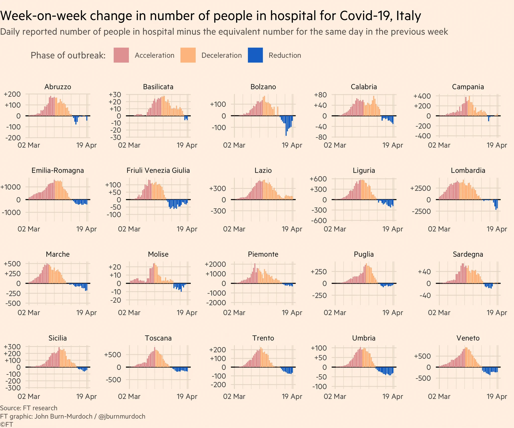
- I talk a lot about whether or not peaks have been reached. A good metric for this is hospitalisations: • More reliable than confirmed cases (not influenced by testing regimes) • Shorter lag than deaths So here are some charts showing hospitalisations in various countries:
- First, Italy: Colour = phase of outbreak • Red: more new hospitalisations every day than day before • Orange: total hospitalisations rising, but rate of increase slowing • Blue: fewer people in hospital than before Almost all Italian regions now in "reduction" phase :-)
- Next, Spain: • Madrid now firmly in "reduction" phase, Catalonia fighting to stay in reduction • I’ve removed other Spanish regions due to problems with their hospitalisation data made clear to me today (thanks to those who raised this)
- France: • Rate of increase in hospitalisations dropping across the board, and some regions beginning to see total occupancy fall including epicentres Ile de France & Grand Est
- US: • Hospitalisation data patchy from state to state • NY & Louisiana both in the "reduction" phase, hospital bed occupancy dropping 👍 • Rate of acceleration falling in NJ & Colorado, hopefully soon net reduction • Connecticut still has a way to go before occupancy falls
- Great Britain: • Hospitals in every region now have fewer covid patients than same time last week 👍 • Suggests UK is at or near peak for new confirmed infections, though UK testing is still lagging, and care homes of course absent from this view
- Stockholm: • Remember Sweden has not locked down like most places. Social gatherings still common. • But data show steady deceleration in new hospitalisations • Daily hospital beds occupied now unchanged vs last week, and on course for net week-on-week reduction very soonWrapping up: our focus has now shifted to tracking excess all-cause mortality (numbers of people dying for any reason at all) as we think this avoids pitfalls of different countries’ covid-death reporting methodologies. So my call-out tonight is:Please point me to data on all-cause mortality (total numbers of deaths from all causes) in your country, by week, up to and including recent weeks 🙏 Reply here, email [email protected] or add a link to this spreadsheet: docs.google.com/spreadsheets/d…Final bits: Here’s a video where I explain why we’re using log scales, showing absolute numbers instead of per capita, and much more: x.com/janinegibson/s…And a chart showing why we're using absolute numbers rather than population-adjusted rates:NEW: ahead of tonight’s main thread, some fresh analysis of the factors that do — and do not — appear to influence the pace of countries’ covid-19 outbreaks. First, for the per-capita brigade: There is only a very very weak relationship between population and covid death toll.Please email [email protected] with feedback, requests & subnational data. All of these are invaluable, and we incorporate your suggestions and data every day. We’ll keep getting back to as many people as possible. Have a good night, folks :-)