
Clears
clears.ai
Accelerate engineering throughput with agentic orchestration from requirements to PRs
clears.ai
AI Breakdown
Design export
# Design brief: the Clears design language

Below is a complete design specification measured from a real, published web page. Use it as a design language for the user's product. It is not a page to reproduce.

## Reference images

- Full page: https://cdn.designmunk.com/2026/10/05152234/clears-ai-featured.webp
- Above the fold: https://cdn.designmunk.com/2026/10/05152234/clears-ai-featured-1440x900.webp
- On DesignMunk: https://designmunk.com/clears/

Study these for hierarchy, rhythm, spacing and density. Where an image and the written spec disagree, the spec wins: the tokens were read from the page's own CSS, the images are one rendering of it.

## Before you start

Ask the user what they are building, who it is for, and what brand assets they already have — name, colours, typefaces. Wait for their answers before writing anything. Everything below is then applied to their product, not to the reference.

## Design specification

# Clears: Dark Orchestration Canvas with Violet Connection Points

## Overview

A dark, developer-centric system designed for clarity and control. Tone is confident and technical, with minimal chrome and restrained color. Interfaces should feel spacious at the page level but compact inside cards. Accent energy comes from two purples and a single soft glow used sparingly around key CTAs and active nodes.

## Page Structure

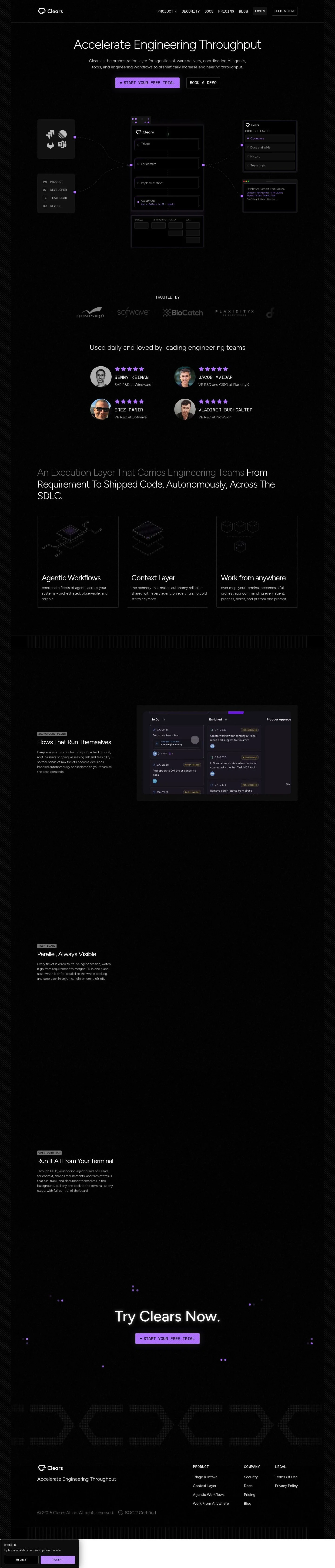
- Global nav: left-aligned logo; right-aligned links for product areas and resources; compact tag-style CTAs for Login and Book a Demo.
- Hero: oversized headline with light weight; one-paragraph subcopy; two CTAs in a row; a central orchestration diagram/canvas sits below the copy.
- Social proof: a "Trusted by" heading followed by a horizontal list of names/titles (text-first) or a slim row of endorsements.
- Capabilities row: short feature blocks for Agentic Workflows, Context Layer, and Work from Anywhere presented as a row of cards.
- Deep-dive feature sections: stacked spotlight bands repeating three themes (Background Flows, Task Board, Open over MCP) with text and an adjacent/underlaid UI visualization.
- Closing CTA: centered headline with a single primary button inviting a free trial.
- Footer: multi-column link lists for Product, Company, and Legal, with certification and copyright on a final row.

## Colors

- Primary (#fcfcfc): High-contrast text and key labels on dark.
- Secondary (#a464fc): Brand accent for links, indicators, and diagram highlights.
- Tertiary (#bf8dff): Primary button fill and luminous accents; pairs with the glow shadow.
- Neutral (#000000): Global background and card base for a deep canvas.
- Border (#374151): Subtle dividers, outlines, and card strokes.
- Surface (#000000): Surface color equals Neutral; use for sections and cards to maintain the dark canvas.
- On-surface (#fcfcfc): Default text on dark surfaces.

## Typography

- Figtree (Google, free): The sole UI family. Headline-lg 73px/1.21 at weight 300 for hero; headline-md 51px/1.2 for major section headers; headline-sm 36px/1.07 for sub-sections; headline-xs 26px/1.19 for card titles; body-md 18px/1.5 for paragraphs. Suitable substitutes: Inter, Sora, or Manrope if Figtree is unavailable.
- Space Mono (Google, free): Optional for code, terminal prompts, or small technical labels. Substitutes: Inconsolata or IBM Plex Mono.
- JetBrains Mono (Google, free): Alternative monospace for code snippets or inline system text. Substitutes: Source Code Pro or IBM Plex Mono.
Use light weights for headings (300) to keep the aesthetic airy on dark; reserve heavier weights (500–700) only for emphasis within small text blocks.

## Layout

Spacing uses compact inner units with wide section gutters. Micro spacing: xs 4px and sm 8px for icon gaps and control paddings. Content spacing: md 14px and lg 24px for button gaps, card padding, and between stacked elements. Section rhythm: xl 160px for top/bottom spacing around major blocks and the hero. Prefer a single central column for copy with adjacent or underlaid visual canvases; feature rows can wrap to a single column on small screens.

## Elevation & Depth

Depth is primarily tonal: black surfaces against slightly brighter text and violet accents. Shadows are minimal; only the small glow is used — rgba(191, 141, 255, 0.18) 0 0 28px — to emphasize primary CTAs or active nodes in diagrams. Hierarchy otherwise relies on whitespace, subtle borders (#374151), and type scale.

## Shapes

Two radii define the language. Rounded sm 4px for interactive controls (buttons, pills, small tags). Rounded md 8px for containers and cards, including nodes within the orchestration diagram. Avoid larger radii to keep the system precise and technical.

## Components

Buttons and card
- Primary Button: #bf8dff fill, text #000000, 4px radius, 48px height, 15px 13px padding. May receive the sm purple glow for emphasis.
- Secondary Button: #000000 fill with #ffffff text, 4px radius, 48px height, 15px 13px padding. When placed on black surfaces, add a 1px #374151 border to preserve affordance.
- Link Button: text #fcfcfc, radius 0; no fill.
- Card: #000000 background, #fcfcfc text, 8px radius, 16px padding, optional 1px #374151 border.

### Top Navigation
- Single row with left logo and right navigation links; compact spacing (lg 24px between items). Login and Book a Demo appear as small 4px-radius buttons. Background stays #000000; add a bottom border #374151 if separation is needed.

### Hero with Orchestration Canvas
- Headline uses headline-lg (73px/300, letter-spacing -0.03em), followed by body-md copy. Two CTAs aligned in a row: primary first, then secondary. A large, centered canvas below shows connected cards, using 8px-radius nodes and violet connection points.

### Trusted-By Strip
- Short heading and a horizontal list of names/titles or logos. Use low-emphasis text (#fcfcfc at reduced opacity) with item gaps at md 14px.

### Feature Cards Row
- A row of small cards highlighting Agentic Workflows, Context Layer, and Work From Anywhere. Each card: 8px radius, 16px padding, title at headline-xs, body-md below, and a subtle #374151 border.

### Spotlight Feature Section
- Repeated band pattern for Background Flows, Task Board, and Open over MCP. Left/right (or stacked) layout pairing a headline-sm block with an illustrative UI panel. Maintain xl 160px vertical padding and keep visuals within 8px-radius frames.

### CTA Band
- Centered headline (headline-sm or md) and a single primary button. Optionally apply the sm glow to the button to conclude the page.

### Footer Columns
- Three link lists (Product, Company, Legal) in columns; body-md links with xs/sm spacing. A thin divider (#374151) can separate the legal row.

## Do's and Don'ts

- Do keep backgrounds pure #000000 and type #fcfcfc for maximum contrast.
- Do reserve the glow shadow for the primary CTA and active diagram nodes only.
- Do stick to 4px radii for controls and 8px for containers; mixing larger curves weakens the technical tone.
- Don't introduce additional accent colors; use #a464fc and #bf8dff exclusively for emphasis and interactive states.
- Don't increase heading weights; the light 300 weight is part of the brand voice on dark.
- Don't rely on a black-on-black secondary button without a #374151 border when it sits on a black surface.

## Agent Prompt Guide

Quick color reference
- Text: #fcfcfc
- Background: #000000
- Border: #374151
- Accent: #a464fc (secondary), #bf8dff (tertiary)

1) Build the hero
- Section background #000000 with xl 160px top/bottom padding.
- Headline: Figtree 73px, weight 300, line-height 1.21, letter-spacing -0.03em, color #fcfcfc, max-width ~12–14ch.
- Body: Figtree 18px/1.5, color #fcfcfc at 88% opacity.
- Buttons in a row with md 14px gap:
  • Primary: 48px height, 15px 13px padding, radius 4px, background #bf8dff, text #000000, apply glow rgba(191,141,255,0.18) 0 0 28px.
  • Secondary: same sizing, radius 4px, background #000000, text #ffffff, 1px border #374151.

2) Feature cards row
- Container on #000000 with lg 24px vertical spacing to the heading.
- Each card: background #000000, 1px border #374151, radius 8px, padding 16px.
- Title: Figtree 26px/1.19 weight 300; Body: 18px/1.5.
- Use #a464fc for small icons or bullets.

3) Spotlight feature band
- Two-column layout on large screens (stack on small). Left: heading Figtree 36px/1.07, right: image/mock card with radius 8px and 1px #374151 border.
- Maintain xl 160px vertical spacing and lg 24px between text and media.
- Use #a464fc for connectors, #bf8dff to highlight active elements.

4) Trusted-by strip
- Thin band with a small heading and a row of names/logos.
- Text: #fcfcfc at 72–80% opacity; item gap md 14px; optional top/bottom border #374151.

5) Footer
- Three columns of links using Figtree 18px/1.5; column gaps lg 24px.
- Section divider #374151; copyright line at reduced opacity.

## Similar Brands

- Vercel: Dark, developer-focused surfaces with restrained accents; Vercel is starker (white accents) while Clears leans into violet highlights and a soft glow.
- Linear: Minimal dark UI and precise spacing; Linear is cooler and flatter, with less decorative glow than Clears.
- HashiCorp: Technical tone and product-led pages; HashiCorp uses more grayscale and denser text blocks versus Clears' airy hero and accent violet.
- OpenAI: Dark backgrounds with spacious type; OpenAI is more editorial and image-driven, while Clears centers a connected workflow diagram.

## Tokens

### CSS custom properties

```css
:root {
  /* Colors */
  --color-primary: #fcfcfc;
  --color-secondary: #a464fc;
  --color-tertiary: #bf8dff;
  --color-neutral: #000000;
  --color-border: #374151;
  --color-surface: var(--color-neutral);
  --color-on-surface: var(--color-primary);

  /* Typography */
  --text-headline-lg-size: 73px;
  --text-headline-lg-weight: 300;
  --text-headline-lg-leading: 1.21;
  --text-headline-lg-tracking: -0.03em;
  --text-headline-md-size: 51px;
  --text-headline-md-weight: 300;
  --text-headline-md-leading: 1.2;
  --text-headline-sm-size: 36px;
  --text-headline-sm-weight: 300;
  --text-headline-sm-leading: 1.07;
  --text-headline-sm-tracking: -0.031em;
  --text-headline-xs-size: 26px;
  --text-headline-xs-weight: 300;
  --text-headline-xs-leading: 1.19;
  --text-body-md-size: 18px;
  --text-body-md-weight: 300;
  --text-body-md-leading: 1.5;
  --font-figtree: "Figtree";

  /* Rounded */
  --radius-sm: 4px;
  --radius-md: 8px;

  /* Spacing */
  --spacing-xs: 4px;
  --spacing-sm: 8px;
  --spacing-md: 14px;
  --spacing-lg: 24px;
  --spacing-xl: 160px;

  /* Components */
  --button-primary-background-color: var(--color-tertiary);
  --button-primary-text-color: var(--color-neutral);
  --button-primary-rounded: var(--radius-sm);
  --button-primary-padding: 15px 13px;
  --button-primary-height: 48px;
  --button-secondary-background-color: var(--color-neutral);
  --button-secondary-text-color: #ffffff;
  --button-secondary-rounded: var(--radius-sm);
  --button-secondary-padding: 15px 13px;
  --button-secondary-height: 48px;
  --button-link-text-color: var(--color-primary);
  --button-link-rounded: 0px;
  --card-background-color: var(--color-neutral);
  --card-text-color: var(--color-primary);
  --card-rounded: var(--radius-md);
  --card-padding: 16px;
}
```

### Tailwind theme

```css
@theme {
  --color-primary: #fcfcfc;
  --color-secondary: #a464fc;
  --color-tertiary: #bf8dff;
  --color-neutral: #000000;
  --color-border: #374151;
  --color-surface: #000000;
  --color-on-surface: #fcfcfc;
  --font-headline-lg: "Figtree";
  --font-headline-md: "Figtree";
  --font-headline-sm: "Figtree";
  --font-headline-xs: "Figtree";
  --font-body-md: "Figtree";
  --text-headline-lg: 73px;
  --text-headline-md: 51px;
  --text-headline-sm: 36px;
  --text-headline-xs: 26px;
  --text-body-md: 18px;
  --tracking-headline-lg: -0.03em;
  --tracking-headline-sm: -0.031em;
  --font-weight-headline-lg: 300;
  --font-weight-headline-md: 300;
  --font-weight-headline-sm: 300;
  --font-weight-headline-xs: 300;
  --font-weight-body-md: 300;
  --radius-sm: 4px;
  --radius-md: 8px;
  --spacing-xs: 4px;
  --spacing-sm: 8px;
  --spacing-md: 14px;
  --spacing-lg: 24px;
  --spacing-xl: 160px;
}
```

### Design tokens (DTCG)

```json
{
    "$schema": "https://www.designtokens.org/schemas/2025.10/format.json",
    "color": {
        "$type": "color",
        "primary": {
            "$value": {
                "colorSpace": "srgb",
                "components": [
                    0.988,
                    0.988,
                    0.988
                ],
                "hex": "#fcfcfc"
            }
        },
        "secondary": {
            "$value": {
                "colorSpace": "srgb",
                "components": [
                    0.643,
                    0.392,
                    0.988
                ],
                "hex": "#a464fc"
            }
        },
        "tertiary": {
            "$value": {
                "colorSpace": "srgb",
                "components": [
                    0.749,
                    0.553,
                    1
                ],
                "hex": "#bf8dff"
            }
        },
        "neutral": {
            "$value": {
                "colorSpace": "srgb",
                "components": [
                    0,
                    0,
                    0
                ],
                "hex": "#000000"
            }
        },
        "border": {
            "$value": {
                "colorSpace": "srgb",
                "components": [
                    0.216,
                    0.255,
                    0.318
                ],
                "hex": "#374151"
            }
        },
        "surface": {
            "$value": {
                "colorSpace": "srgb",
                "components": [
                    0,
                    0,
                    0
                ],
                "hex": "#000000"
            }
        },
        "on-surface": {
            "$value": {
                "colorSpace": "srgb",
                "components": [
                    0.988,
                    0.988,
                    0.988
                ],
                "hex": "#fcfcfc"
            }
        }
    },
    "spacing": {
        "$type": "dimension",
        "xs": {
            "$value": {
                "value": 4,
                "unit": "px"
            }
        },
        "sm": {
            "$value": {
                "value": 8,
                "unit": "px"
            }
        },
        "md": {
            "$value": {
                "value": 14,
                "unit": "px"
            }
        },
        "lg": {
            "$value": {
                "value": 24,
                "unit": "px"
            }
        },
        "xl": {
            "$value": {
                "value": 160,
                "unit": "px"
            }
        }
    },
    "rounded": {
        "$type": "dimension",
        "sm": {
            "$value": {
                "value": 4,
                "unit": "px"
            }
        },
        "md": {
            "$value": {
                "value": 8,
                "unit": "px"
            }
        }
    },
    "typography": {
        "headline-lg": {
            "$type": "typography",
            "$value": {
                "fontFamily": "Figtree",
                "fontSize": {
                    "value": 73,
                    "unit": "px"
                },
                "fontWeight": 300,
                "letterSpacing": {
                    "value": -0.03,
                    "unit": "em"
                }
            }
        },
        "headline-md": {
            "$type": "typography",
            "$value": {
                "fontFamily": "Figtree",
                "fontSize": {
                    "value": 51,
                    "unit": "px"
                },
                "fontWeight": 300
            }
        },
        "headline-sm": {
            "$type": "typography",
            "$value": {
                "fontFamily": "Figtree",
                "fontSize": {
                    "value": 36,
                    "unit": "px"
                },
                "fontWeight": 300,
                "letterSpacing": {
                    "value": -0.031,
                    "unit": "em"
                }
            }
        },
        "headline-xs": {
            "$type": "typography",
            "$value": {
                "fontFamily": "Figtree",
                "fontSize": {
                    "value": 26,
                    "unit": "px"
                },
                "fontWeight": 300
            }
        },
        "body-md": {
            "$type": "typography",
            "$value": {
                "fontFamily": "Figtree",
                "fontSize": {
                    "value": 18,
                    "unit": "px"
                },
                "fontWeight": 300
            }
        }
    }
}
```

## Rules

- **Fonts.** If the specification names a custom or self-hosted family, use one of the substitutes it names. Never reference a typeface you cannot actually load — it will fall back to a system font and undo the typography.
- **Colour.** Derive the palette from the user's brand. Use the token values as a guide to *relationships* — contrast, tint, how many accents carry the page — not as hex codes to paste.
- **Never reproduce** the wordmark, mascot, logo, brand name, illustrations, icon set, screenshots or any copy from the reference.
- **Never present the result as Clears**, or imply any connection to it.
- If something is unspecified, choose clarity and legibility over decoration.
---
version: alpha
name: Clears
description: Accelerate engineering throughput with agentic orchestration from requirements to PRs
colors:
  primary: "#fcfcfc"
  secondary: "#a464fc"
  tertiary: "#bf8dff"
  neutral: "#000000"
  border: "#374151"
  surface: "{colors.neutral}"
  on-surface: "{colors.primary}"
typography:
  headline-lg:
    fontFamily: Figtree
    fontSize: 73px
    fontWeight: 300
    lineHeight: 1.21
    letterSpacing: -0.03em
  headline-md:
    fontFamily: Figtree
    fontSize: 51px
    fontWeight: 300
    lineHeight: 1.2
  headline-sm:
    fontFamily: Figtree
    fontSize: 36px
    fontWeight: 300
    lineHeight: 1.07
    letterSpacing: -0.031em
  headline-xs:
    fontFamily: Figtree
    fontSize: 26px
    fontWeight: 300
    lineHeight: 1.19
  body-md:
    fontFamily: Figtree
    fontSize: 18px
    fontWeight: 300
    lineHeight: 1.5
rounded:
  sm: 4px
  md: 8px
spacing:
  xs: 4px
  sm: 8px
  md: 14px
  lg: 24px
  xl: 160px
components:
  button-primary:
    backgroundColor: "{colors.tertiary}"
    textColor: "{colors.neutral}"
    rounded: "{rounded.sm}"
    padding: 15px 13px
    height: 48px
  button-secondary:
    backgroundColor: "{colors.neutral}"
    textColor: "#ffffff"
    rounded: "{rounded.sm}"
    padding: 15px 13px
    height: 48px
  button-link:
    textColor: "{colors.primary}"
    rounded: 0px
  card:
    backgroundColor: "{colors.neutral}"
    textColor: "{colors.primary}"
    rounded: "{rounded.md}"
    padding: 16px
---

# Clears: Dark Orchestration Canvas with Violet Connection Points

## Overview

A dark, developer-centric system designed for clarity and control. Tone is confident and technical, with minimal chrome and restrained color. Interfaces should feel spacious at the page level but compact inside cards. Accent energy comes from two purples and a single soft glow used sparingly around key CTAs and active nodes.

## Page Structure

- Global nav: left-aligned logo; right-aligned links for product areas and resources; compact tag-style CTAs for Login and Book a Demo.
- Hero: oversized headline with light weight; one-paragraph subcopy; two CTAs in a row; a central orchestration diagram/canvas sits below the copy.
- Social proof: a "Trusted by" heading followed by a horizontal list of names/titles (text-first) or a slim row of endorsements.
- Capabilities row: short feature blocks for Agentic Workflows, Context Layer, and Work from Anywhere presented as a row of cards.
- Deep-dive feature sections: stacked spotlight bands repeating three themes (Background Flows, Task Board, Open over MCP) with text and an adjacent/underlaid UI visualization.
- Closing CTA: centered headline with a single primary button inviting a free trial.
- Footer: multi-column link lists for Product, Company, and Legal, with certification and copyright on a final row.

## Colors

- Primary (#fcfcfc): High-contrast text and key labels on dark.
- Secondary (#a464fc): Brand accent for links, indicators, and diagram highlights.
- Tertiary (#bf8dff): Primary button fill and luminous accents; pairs with the glow shadow.
- Neutral (#000000): Global background and card base for a deep canvas.
- Border (#374151): Subtle dividers, outlines, and card strokes.
- Surface (#000000): Surface color equals Neutral; use for sections and cards to maintain the dark canvas.
- On-surface (#fcfcfc): Default text on dark surfaces.

## Typography

- Figtree (Google, free): The sole UI family. Headline-lg 73px/1.21 at weight 300 for hero; headline-md 51px/1.2 for major section headers; headline-sm 36px/1.07 for sub-sections; headline-xs 26px/1.19 for card titles; body-md 18px/1.5 for paragraphs. Suitable substitutes: Inter, Sora, or Manrope if Figtree is unavailable.
- Space Mono (Google, free): Optional for code, terminal prompts, or small technical labels. Substitutes: Inconsolata or IBM Plex Mono.
- JetBrains Mono (Google, free): Alternative monospace for code snippets or inline system text. Substitutes: Source Code Pro or IBM Plex Mono.
Use light weights for headings (300) to keep the aesthetic airy on dark; reserve heavier weights (500–700) only for emphasis within small text blocks.

## Layout

Spacing uses compact inner units with wide section gutters. Micro spacing: xs 4px and sm 8px for icon gaps and control paddings. Content spacing: md 14px and lg 24px for button gaps, card padding, and between stacked elements. Section rhythm: xl 160px for top/bottom spacing around major blocks and the hero. Prefer a single central column for copy with adjacent or underlaid visual canvases; feature rows can wrap to a single column on small screens.

## Elevation & Depth

Depth is primarily tonal: black surfaces against slightly brighter text and violet accents. Shadows are minimal; only the small glow is used — rgba(191, 141, 255, 0.18) 0 0 28px — to emphasize primary CTAs or active nodes in diagrams. Hierarchy otherwise relies on whitespace, subtle borders (#374151), and type scale.

## Shapes

Two radii define the language. Rounded sm 4px for interactive controls (buttons, pills, small tags). Rounded md 8px for containers and cards, including nodes within the orchestration diagram. Avoid larger radii to keep the system precise and technical.

## Components

Buttons and card
- Primary Button: #bf8dff fill, text #000000, 4px radius, 48px height, 15px 13px padding. May receive the sm purple glow for emphasis.
- Secondary Button: #000000 fill with #ffffff text, 4px radius, 48px height, 15px 13px padding. When placed on black surfaces, add a 1px #374151 border to preserve affordance.
- Link Button: text #fcfcfc, radius 0; no fill.
- Card: #000000 background, #fcfcfc text, 8px radius, 16px padding, optional 1px #374151 border.

### Top Navigation
- Single row with left logo and right navigation links; compact spacing (lg 24px between items). Login and Book a Demo appear as small 4px-radius buttons. Background stays #000000; add a bottom border #374151 if separation is needed.

### Hero with Orchestration Canvas
- Headline uses headline-lg (73px/300, letter-spacing -0.03em), followed by body-md copy. Two CTAs aligned in a row: primary first, then secondary. A large, centered canvas below shows connected cards, using 8px-radius nodes and violet connection points.

### Trusted-By Strip
- Short heading and a horizontal list of names/titles or logos. Use low-emphasis text (#fcfcfc at reduced opacity) with item gaps at md 14px.

### Feature Cards Row
- A row of small cards highlighting Agentic Workflows, Context Layer, and Work From Anywhere. Each card: 8px radius, 16px padding, title at headline-xs, body-md below, and a subtle #374151 border.

### Spotlight Feature Section
- Repeated band pattern for Background Flows, Task Board, and Open over MCP. Left/right (or stacked) layout pairing a headline-sm block with an illustrative UI panel. Maintain xl 160px vertical padding and keep visuals within 8px-radius frames.

### CTA Band
- Centered headline (headline-sm or md) and a single primary button. Optionally apply the sm glow to the button to conclude the page.

### Footer Columns
- Three link lists (Product, Company, Legal) in columns; body-md links with xs/sm spacing. A thin divider (#374151) can separate the legal row.

## Do's and Don'ts

- Do keep backgrounds pure #000000 and type #fcfcfc for maximum contrast.
- Do reserve the glow shadow for the primary CTA and active diagram nodes only.
- Do stick to 4px radii for controls and 8px for containers; mixing larger curves weakens the technical tone.
- Don't introduce additional accent colors; use #a464fc and #bf8dff exclusively for emphasis and interactive states.
- Don't increase heading weights; the light 300 weight is part of the brand voice on dark.
- Don't rely on a black-on-black secondary button without a #374151 border when it sits on a black surface.

## Agent Prompt Guide

Quick color reference
- Text: #fcfcfc
- Background: #000000
- Border: #374151
- Accent: #a464fc (secondary), #bf8dff (tertiary)

1) Build the hero
- Section background #000000 with xl 160px top/bottom padding.
- Headline: Figtree 73px, weight 300, line-height 1.21, letter-spacing -0.03em, color #fcfcfc, max-width ~12–14ch.
- Body: Figtree 18px/1.5, color #fcfcfc at 88% opacity.
- Buttons in a row with md 14px gap:
  • Primary: 48px height, 15px 13px padding, radius 4px, background #bf8dff, text #000000, apply glow rgba(191,141,255,0.18) 0 0 28px.
  • Secondary: same sizing, radius 4px, background #000000, text #ffffff, 1px border #374151.

2) Feature cards row
- Container on #000000 with lg 24px vertical spacing to the heading.
- Each card: background #000000, 1px border #374151, radius 8px, padding 16px.
- Title: Figtree 26px/1.19 weight 300; Body: 18px/1.5.
- Use #a464fc for small icons or bullets.

3) Spotlight feature band
- Two-column layout on large screens (stack on small). Left: heading Figtree 36px/1.07, right: image/mock card with radius 8px and 1px #374151 border.
- Maintain xl 160px vertical spacing and lg 24px between text and media.
- Use #a464fc for connectors, #bf8dff to highlight active elements.

4) Trusted-by strip
- Thin band with a small heading and a row of names/logos.
- Text: #fcfcfc at 72–80% opacity; item gap md 14px; optional top/bottom border #374151.

5) Footer
- Three columns of links using Figtree 18px/1.5; column gaps lg 24px.
- Section divider #374151; copyright line at reduced opacity.

## Similar Brands

- Vercel: Dark, developer-focused surfaces with restrained accents; Vercel is starker (white accents) while Clears leans into violet highlights and a soft glow.
- Linear: Minimal dark UI and precise spacing; Linear is cooler and flatter, with less decorative glow than Clears.
- HashiCorp: Technical tone and product-led pages; HashiCorp uses more grayscale and denser text blocks versus Clears' airy hero and accent violet.
- OpenAI: Dark backgrounds with spacious type; OpenAI is more editorial and image-driven, while Clears centers a connected workflow diagram.
:root {
  /* Colors */
  --color-primary: #fcfcfc;
  --color-secondary: #a464fc;
  --color-tertiary: #bf8dff;
  --color-neutral: #000000;
  --color-border: #374151;
  --color-surface: var(--color-neutral);
  --color-on-surface: var(--color-primary);

  /* Typography */
  --text-headline-lg-size: 73px;
  --text-headline-lg-weight: 300;
  --text-headline-lg-leading: 1.21;
  --text-headline-lg-tracking: -0.03em;
  --text-headline-md-size: 51px;
  --text-headline-md-weight: 300;
  --text-headline-md-leading: 1.2;
  --text-headline-sm-size: 36px;
  --text-headline-sm-weight: 300;
  --text-headline-sm-leading: 1.07;
  --text-headline-sm-tracking: -0.031em;
  --text-headline-xs-size: 26px;
  --text-headline-xs-weight: 300;
  --text-headline-xs-leading: 1.19;
  --text-body-md-size: 18px;
  --text-body-md-weight: 300;
  --text-body-md-leading: 1.5;
  --font-figtree: "Figtree";

  /* Rounded */
  --radius-sm: 4px;
  --radius-md: 8px;

  /* Spacing */
  --spacing-xs: 4px;
  --spacing-sm: 8px;
  --spacing-md: 14px;
  --spacing-lg: 24px;
  --spacing-xl: 160px;

  /* Components */
  --button-primary-background-color: var(--color-tertiary);
  --button-primary-text-color: var(--color-neutral);
  --button-primary-rounded: var(--radius-sm);
  --button-primary-padding: 15px 13px;
  --button-primary-height: 48px;
  --button-secondary-background-color: var(--color-neutral);
  --button-secondary-text-color: #ffffff;
  --button-secondary-rounded: var(--radius-sm);
  --button-secondary-padding: 15px 13px;
  --button-secondary-height: 48px;
  --button-link-text-color: var(--color-primary);
  --button-link-rounded: 0px;
  --card-background-color: var(--color-neutral);
  --card-text-color: var(--color-primary);
  --card-rounded: var(--radius-md);
  --card-padding: 16px;
}
{
  "$schema": "https://www.designtokens.org/schemas/2025.10/format.json",
  "$description": "Accelerate engineering throughput with agentic orchestration from requirements to PRs",
  "color": {
    "$type": "color",
    "primary": {
      "$value": {
        "colorSpace": "srgb",
        "components": [
          0.988,
          0.988,
          0.988
        ],
        "hex": "#fcfcfc"
      }
    },
    "secondary": {
      "$value": {
        "colorSpace": "srgb",
        "components": [
          0.643,
          0.392,
          0.988
        ],
        "hex": "#a464fc"
      }
    },
    "tertiary": {
      "$value": {
        "colorSpace": "srgb",
        "components": [
          0.749,
          0.553,
          1
        ],
        "hex": "#bf8dff"
      }
    },
    "neutral": {
      "$value": {
        "colorSpace": "srgb",
        "components": [
          0,
          0,
          0
        ],
        "hex": "#000000"
      }
    },
    "border": {
      "$value": {
        "colorSpace": "srgb",
        "components": [
          0.216,
          0.255,
          0.318
        ],
        "hex": "#374151"
      }
    },
    "surface": {
      "$value": {
        "colorSpace": "srgb",
        "components": [
          0,
          0,
          0
        ],
        "hex": "#000000"
      }
    },
    "on-surface": {
      "$value": {
        "colorSpace": "srgb",
        "components": [
          0.988,
          0.988,
          0.988
        ],
        "hex": "#fcfcfc"
      }
    }
  },
  "spacing": {
    "$type": "dimension",
    "xs": {
      "$value": {
        "value": 4,
        "unit": "px"
      }
    },
    "sm": {
      "$value": {
        "value": 8,
        "unit": "px"
      }
    },
    "md": {
      "$value": {
        "value": 14,
        "unit": "px"
      }
    },
    "lg": {
      "$value": {
        "value": 24,
        "unit": "px"
      }
    },
    "xl": {
      "$value": {
        "value": 160,
        "unit": "px"
      }
    }
  },
  "rounded": {
    "$type": "dimension",
    "sm": {
      "$value": {
        "value": 4,
        "unit": "px"
      }
    },
    "md": {
      "$value": {
        "value": 8,
        "unit": "px"
      }
    }
  },
  "typography": {
    "headline-lg": {
      "$type": "typography",
      "$value": {
        "fontFamily": "Figtree",
        "fontSize": {
          "value": 73,
          "unit": "px"
        },
        "fontWeight": 300,
        "letterSpacing": {
          "value": -0.03,
          "unit": "em"
        }
      }
    },
    "headline-md": {
      "$type": "typography",
      "$value": {
        "fontFamily": "Figtree",
        "fontSize": {
          "value": 51,
          "unit": "px"
        },
        "fontWeight": 300
      }
    },
    "headline-sm": {
      "$type": "typography",
      "$value": {
        "fontFamily": "Figtree",
        "fontSize": {
          "value": 36,
          "unit": "px"
        },
        "fontWeight": 300,
        "letterSpacing": {
          "value": -0.031,
          "unit": "em"
        }
      }
    },
    "headline-xs": {
      "$type": "typography",
      "$value": {
        "fontFamily": "Figtree",
        "fontSize": {
          "value": 26,
          "unit": "px"
        },
        "fontWeight": 300
      }
    },
    "body-md": {
      "$type": "typography",
      "$value": {
        "fontFamily": "Figtree",
        "fontSize": {
          "value": 18,
          "unit": "px"
        },
        "fontWeight": 300
      }
    }
  }
}
@theme {
--color-primary: #fcfcfc;
--color-secondary: #a464fc;
--color-tertiary: #bf8dff;
--color-neutral: #000000;
--color-border: #374151;
--color-surface: #000000;
--color-on-surface: #fcfcfc;
--font-headline-lg: "Figtree";
--font-headline-md: "Figtree";
--font-headline-sm: "Figtree";
--font-headline-xs: "Figtree";
--font-body-md: "Figtree";
--text-headline-lg: 73px;
--text-headline-md: 51px;
--text-headline-sm: 36px;
--text-headline-xs: 26px;
--text-body-md: 18px;
--tracking-headline-lg: -0.03em;
--tracking-headline-sm: -0.031em;
--font-weight-headline-lg: 300;
--font-weight-headline-md: 300;
--font-weight-headline-sm: 300;
--font-weight-headline-xs: 300;
--font-weight-body-md: 300;
--radius-sm: 4px;
--radius-md: 8px;
--spacing-xs: 4px;
--spacing-sm: 8px;
--spacing-md: 14px;
--spacing-lg: 24px;
--spacing-xl: 160px;
} # Design brief: the Clears design language
Below is a complete design specification measured from a real, published web page. Use it as a design language for the user's product. It is not a page to reproduce.
## Reference images
- Full page: https://cdn.designmunk.com/2026/10/05152234/clears-ai-featured.webp
- Above the fold: https://cdn.designmunk.com/2026/10/05152234/clears-ai-featured-1440x900.webp
- On DesignMunk: https://designmunk.com/clears/
Study these for hierarchy, rhythm, spacing and density. Where an image and the written spec disagree, the spec wins: the tokens were read from the page's own CSS, the images are one rendering of it.
## Before you start
Ask the user what they are building, who it is for, and what brand assets they already have — name, colours, typefaces. Wait for their answers before writing anything. Everything below is then applied to their product, not to the reference.
## Design specification
# Clears: Dark Orchestration Canvas with Violet Connection Points
## Overview
A dark, developer-centric system designed for clarity and control. Tone is confident and technical, with minimal chrome and restrained color. Interfaces should feel spacious at the page level but compact inside cards. Accent energy comes from two purples and a single soft glow used sparingly around key CTAs and active nodes.
## Page Structure
- Global nav: left-aligned logo; right-aligned links for product areas and resources; compact tag-style CTAs for Login and Book a Demo.
- Hero: oversized headline with light weight; one-paragraph subcopy; two CTAs in a row; a central orchestration diagram/canvas sits below the copy.
- Social proof: a "Trusted by" heading followed by a horizontal list of names/titles (text-first) or a slim row of endorsements.
- Capabilities row: short feature blocks for Agentic Workflows, Context Layer, and Work from Anywhere presented as a row of cards.
- Deep-dive feature sections: stacked spotlight bands repeating three themes (Background Flows, Task Board, Open over MCP) with text and an adjacent/underlaid UI visualization.
- Closing CTA: centered headline with a single primary button inviting a free trial.
- Footer: multi-column link lists for Product, Company, and Legal, with certification and copyright on a final row.
## Colors
- Primary (#fcfcfc): High-contrast text and key labels on dark.
- Secondary (#a464fc): Brand accent for links, indicators, and diagram highlights.
- Tertiary (#bf8dff): Primary button fill and luminous accents; pairs with the glow shadow.
- Neutral (#000000): Global background and card base for a deep canvas.
- Border (#374151): Subtle dividers, outlines, and card strokes.
- Surface (#000000): Surface color equals Neutral; use for sections and cards to maintain the dark canvas.
- On-surface (#fcfcfc): Default text on dark surfaces.
## Typography
- Figtree (Google, free): The sole UI family. Headline-lg 73px/1.21 at weight 300 for hero; headline-md 51px/1.2 for major section headers; headline-sm 36px/1.07 for sub-sections; headline-xs 26px/1.19 for card titles; body-md 18px/1.5 for paragraphs. Suitable substitutes: Inter, Sora, or Manrope if Figtree is unavailable.
- Space Mono (Google, free): Optional for code, terminal prompts, or small technical labels. Substitutes: Inconsolata or IBM Plex Mono.
- JetBrains Mono (Google, free): Alternative monospace for code snippets or inline system text. Substitutes: Source Code Pro or IBM Plex Mono.
Use light weights for headings (300) to keep the aesthetic airy on dark; reserve heavier weights (500–700) only for emphasis within small text blocks.
## Layout
Spacing uses compact inner units with wide section gutters. Micro spacing: xs 4px and sm 8px for icon gaps and control paddings. Content spacing: md 14px and lg 24px for button gaps, card padding, and between stacked elements. Section rhythm: xl 160px for top/bottom spacing around major blocks and the hero. Prefer a single central column for copy with adjacent or underlaid visual canvases; feature rows can wrap to a single column on small screens.
## Elevation & Depth
Depth is primarily tonal: black surfaces against slightly brighter text and violet accents. Shadows are minimal; only the small glow is used — rgba(191, 141, 255, 0.18) 0 0 28px — to emphasize primary CTAs or active nodes in diagrams. Hierarchy otherwise relies on whitespace, subtle borders (#374151), and type scale.
## Shapes
Two radii define the language. Rounded sm 4px for interactive controls (buttons, pills, small tags). Rounded md 8px for containers and cards, including nodes within the orchestration diagram. Avoid larger radii to keep the system precise and technical.
## Components
Buttons and card
- Primary Button: #bf8dff fill, text #000000, 4px radius, 48px height, 15px 13px padding. May receive the sm purple glow for emphasis.
- Secondary Button: #000000 fill with #ffffff text, 4px radius, 48px height, 15px 13px padding. When placed on black surfaces, add a 1px #374151 border to preserve affordance.
- Link Button: text #fcfcfc, radius 0; no fill.
- Card: #000000 background, #fcfcfc text, 8px radius, 16px padding, optional 1px #374151 border.
### Top Navigation
- Single row with left logo and right navigation links; compact spacing (lg 24px between items). Login and Book a Demo appear as small 4px-radius buttons. Background stays #000000; add a bottom border #374151 if separation is needed.
### Hero with Orchestration Canvas
- Headline uses headline-lg (73px/300, letter-spacing -0.03em), followed by body-md copy. Two CTAs aligned in a row: primary first, then secondary. A large, centered canvas below shows connected cards, using 8px-radius nodes and violet connection points.
### Trusted-By Strip
- Short heading and a horizontal list of names/titles or logos. Use low-emphasis text (#fcfcfc at reduced opacity) with item gaps at md 14px.
### Feature Cards Row
- A row of small cards highlighting Agentic Workflows, Context Layer, and Work From Anywhere. Each card: 8px radius, 16px padding, title at headline-xs, body-md below, and a subtle #374151 border.
### Spotlight Feature Section
- Repeated band pattern for Background Flows, Task Board, and Open over MCP. Left/right (or stacked) layout pairing a headline-sm block with an illustrative UI panel. Maintain xl 160px vertical padding and keep visuals within 8px-radius frames.
### CTA Band
- Centered headline (headline-sm or md) and a single primary button. Optionally apply the sm glow to the button to conclude the page.
### Footer Columns
- Three link lists (Product, Company, Legal) in columns; body-md links with xs/sm spacing. A thin divider (#374151) can separate the legal row.
## Do's and Don'ts
- Do keep backgrounds pure #000000 and type #fcfcfc for maximum contrast.
- Do reserve the glow shadow for the primary CTA and active diagram nodes only.
- Do stick to 4px radii for controls and 8px for containers; mixing larger curves weakens the technical tone.
- Don't introduce additional accent colors; use #a464fc and #bf8dff exclusively for emphasis and interactive states.
- Don't increase heading weights; the light 300 weight is part of the brand voice on dark.
- Don't rely on a black-on-black secondary button without a #374151 border when it sits on a black surface.
## Agent Prompt Guide
Quick color reference
- Text: #fcfcfc
- Background: #000000
- Border: #374151
- Accent: #a464fc (secondary), #bf8dff (tertiary)
1) Build the hero
- Section background #000000 with xl 160px top/bottom padding.
- Headline: Figtree 73px, weight 300, line-height 1.21, letter-spacing -0.03em, color #fcfcfc, max-width ~12–14ch.
- Body: Figtree 18px/1.5, color #fcfcfc at 88% opacity.
- Buttons in a row with md 14px gap:
• Primary: 48px height, 15px 13px padding, radius 4px, background #bf8dff, text #000000, apply glow rgba(191,141,255,0.18) 0 0 28px.
• Secondary: same sizing, radius 4px, background #000000, text #ffffff, 1px border #374151.
2) Feature cards row
- Container on #000000 with lg 24px vertical spacing to the heading.
- Each card: background #000000, 1px border #374151, radius 8px, padding 16px.
- Title: Figtree 26px/1.19 weight 300; Body: 18px/1.5.
- Use #a464fc for small icons or bullets.
3) Spotlight feature band
- Two-column layout on large screens (stack on small). Left: heading Figtree 36px/1.07, right: image/mock card with radius 8px and 1px #374151 border.
- Maintain xl 160px vertical spacing and lg 24px between text and media.
- Use #a464fc for connectors, #bf8dff to highlight active elements.
4) Trusted-by strip
- Thin band with a small heading and a row of names/logos.
- Text: #fcfcfc at 72–80% opacity; item gap md 14px; optional top/bottom border #374151.
5) Footer
- Three columns of links using Figtree 18px/1.5; column gaps lg 24px.
- Section divider #374151; copyright line at reduced opacity.
## Tokens
### CSS custom properties
```css
:root {
/* Colors */
--color-primary: #fcfcfc;
--color-secondary: #a464fc;
--color-tertiary: #bf8dff;
--color-neutral: #000000;
--color-border: #374151;
--color-surface: var(--color-neutral);
--color-on-surface: var(--color-primary);
/* Typography */
--text-headline-lg-size: 73px;
--text-headline-lg-weight: 300;
--text-headline-lg-leading: 1.21;
--text-headline-lg-tracking: -0.03em;
--text-headline-md-size: 51px;
--text-headline-md-weight: 300;
--text-headline-md-leading: 1.2;
--text-headline-sm-size: 36px;
--text-headline-sm-weight: 300;
--text-headline-sm-leading: 1.07;
--text-headline-sm-tracking: -0.031em;
--text-headline-xs-size: 26px;
--text-headline-xs-weight: 300;
--text-headline-xs-leading: 1.19;
--text-body-md-size: 18px;
--text-body-md-weight: 300;
--text-body-md-leading: 1.5;
--font-figtree: "Figtree";
/* Rounded */
--radius-sm: 4px;
--radius-md: 8px;
/* Spacing */
--spacing-xs: 4px;
--spacing-sm: 8px;
--spacing-md: 14px;
--spacing-lg: 24px;
--spacing-xl: 160px;
/* Components */
--button-primary-background-color: var(--color-tertiary);
--button-primary-text-color: var(--color-neutral);
--button-primary-rounded: var(--radius-sm);
--button-primary-padding: 15px 13px;
--button-primary-height: 48px;
--button-secondary-background-color: var(--color-neutral);
--button-secondary-text-color: #ffffff;
--button-secondary-rounded: var(--radius-sm);
--button-secondary-padding: 15px 13px;
--button-secondary-height: 48px;
--button-link-text-color: var(--color-primary);
--button-link-rounded: 0px;
--card-background-color: var(--color-neutral);
--card-text-color: var(--color-primary);
--card-rounded: var(--radius-md);
--card-padding: 16px;
}
```
## Rules
- **Fonts.** If the specification names a custom or self-hosted family, use one of the substitutes it names. Never reference a typeface you cannot actually load — it will fall back to a system font and undo the typography.
- **Colour.** Derive the palette from the user's brand. Use the token values as a guide to *relationships* — contrast, tint, how many accents carry the page — not as hex codes to paste.
- **Never reproduce** the wordmark, mascot, logo, brand name, illustrations, icon set, screenshots or any copy from the reference.
- **Never present the result as Clears**, or imply any connection to it.
- If something is unspecified, choose clarity and legibility over decoration.