Repository navigation
with an additional icon on the right side the notification is "misplaced" in the webUI #6426
Description
Activity
one could also say, a plugin should additional icons only on the left side of the notification bell. In my opinion, the bell should be at second place, after the preferences (from right to left). But ok, its there, and I think its not ok to put arbitrary plugin icons in between.
And if they do, they should care for the results, so it does not look like an original nextcloud issue for me, but of this plugin (to be honest, I dont know what this comes from, is ojsxc an app or plugin?!)
@hajika
i don't think so... from my point of view the order is completely fine (expandable search-notifications-additional icons-contacts-settings), since the notification bell only appears from time to time, and so it is ensured that the permanent icons stay on their place.
and also the end-user don't care where the icons come from (and an derived order from that) or who coded the core, plugin or app... the UX must match.the one thing i'm with you is, that devs should care about the results of their code and so ojsxc-devs should have tested their code with NC12 and already reported an issue for that.
--> i'm pretty sure it is an NC-core issue, since ojsxc won't have an influence where the notification-pointer is displayed.btw: what do you mean with plugin or app? - what is the difference?
and so it is ensured that the permanent icons stay on their place.
ok maybe the permanent icons, but not the default system icons. To be honest, I didn't know that there is a specific space reserved for custom icons. I thought, apps put them somewhere in the menu on there own. Then I must say, that in my view the order is bad and
notificationshould be right ofadditional iconsor even better next tosettings.btw: what do you mean with plugin or app? - what is the difference?
you can ignore that, I was just a bit confused about this xmpp app
cc @nextcloud/designers @nickvergessen
I always said hardcoding is bad :P
Maybe we can have something like a "anchor to item" method, which makes the anchor appear on the target item instead based on the dropdown?Reacted by DJCrashdummy and John MolakvoæI know it's bad. ;) However, it's also bad to just have other apps register in random places. Additional apps like Chat should register left of the main icons Settings, Contacts and Notifications, also from a design perspective. No overengineering with a specific method needed. ;)
I tried to make a fix for it in nextcloud/jsxc.nextcloud#70.
Note: if we want to fix this the correct way a server API would be good, because I think there are still some potential edge cases left: e.g. the Chat icon loads first and then a new icon is loaded. Fortunately this is currently not the case (since the notifications just hides it's icon, and the Chat app is a bit slower in loading the icon), but I think this could occur in the future again. 🙈
@nickvergessen I already tried and we can't position the icon based on the menu icon directly AND have a fixed menu. This is directly related to the position:relative (or not) of the icon on the header.
This also block the max width of the menu content since it's being resize on small screens! :/i'm pretty sure it is an NC-core issue, since ojsxc won't have an influence where the notifications are displayed.
It's no NC core issue, because this icon is just injected by jsxc with some js.
can you make sure the additional icons are added to the left of the notification icon?
I will review & merge @LEDfan pr and hopefully this will solve the issue, but as he said a more generic API would be great.
It's no NC core issue, because this icon is just injected by jsxc with some js.
from my point of view NOT the placement of the icon(s) is the issue (this is absolutely fine!), but just the wrong notification-pointer is the issue.
--> maybe for a quick and easy workaround just the pointer can be left out like in NC <12?
for the long-term (maybe with a server API) hopefully a kind of order i already mentioned can be achieved:
expandable search-temporary icons (= foreign- & nexcloud-icons)-permanent icons (= foreign- & nexcloud-icons)
because from the perspective of an enduser it never minds from which code the icon comes from (the most don't even know and aren't interested in getting to know) and thus the best for the UX would be when the permanent icons (regardless if they are own or foreign) have and stay always on their fixed place.have and stay always on their fixed place.
+1
@DJCrashdummy @hajika sooner or later Notifications might become permanent. We’re also checking anyway how we can more and more combine the Contacts menu and the Chat app. Please review nextcloud/jsxc.nextcloud#70 as that fixes the issue.
maybe for a quick and easy workaround just the pointer can be left out like in <NC12?
We will not leave out the pointer because it’s important for the sense of space where it came from. Since it is an app which breaks the core experience, we need to fix that app. ;)
An API to inject icons there is not likely something we will do because we already have apps on the left, and having more on the right will lead to issues on smaller screens or mobile - and in general too much stuff floating around in the header.
the best for the UX would be when the permanent icons (regardless if they are own or foreign) have and stay always on their fixed place.
Well, UX-wise it does not make too much sense to have the Notifications icon show when there are no new notifications. As said above »sooner or later Notifications might become permanent«, but for now we only show it when there is actual content to show.


sorry for not filling the whole bugreport, but i think in this case it isn't that necessary and so i want to save your and my time! if it is nevertheless required, just say so and i'll add a full bugreport when i've got the time to do so...
well... a picture says more than thousand words:
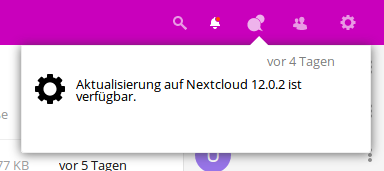
i know it is a completely negligible cosmetic issue, but i just wanted to mention it...
ojsxc) and then as always the additional JSXC-icon appears on the right side.